

Michelangelo Buonarroti’s handwriting takes on a new life thanks to Michelangelus, the typeface created for the Microsoft Office ecosystem. The project, commissioned by the Fabbrica di San Pietro in the Vatican and developed by studiogusto®, transforms the distinctive features of the artist’s handwriting into a contemporary typeface system, designed to be legible, versatile, and freely accessible to people and organizations around the world. The connection between Michelangelo and the Fabbrica di San Pietro spans the centuries. With Michelangelus, this relationship takes on a new dimension: now the artist’s handwriting, too, becomes a tool for highlighting and bringing to life our historical and cultural heritage.
The goal of the project was not simply to reproduce Michelangelo’s calligraphy, nor to superficially imitate his strokes. The research focused onidentifying the visual principles that make his handwriting recognizable: proportions, rhythm, balance, angles, and the relationship between solid and negative space. The artist’s handwriting, in fact, reveals a unique tension between expressive energy and control. The density of the strokes alternates with pauses and accelerations, while lines, curves, and angles are organized according to an order that, while appearing spontaneous, maintains a rigorous structure. It is precisely this combination of freedom and discipline that guided the design of Michelangelus.
The transition from individual handwriting to a typeface required a complex process of analysis and interpretation. The irregularities inherent in the manual gesture were studied to distinguish recurring characteristics from occasional elements, transforming the former into consistent and reproducible rules. The result thus preserves the identity of the original handwriting, adapting it to the needs of contemporary communication.
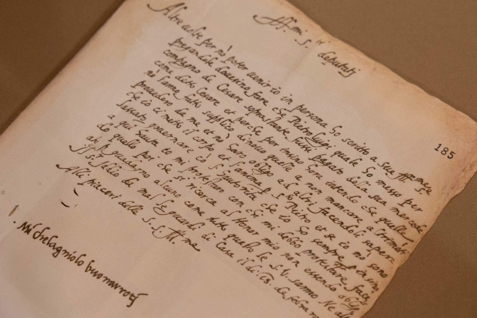
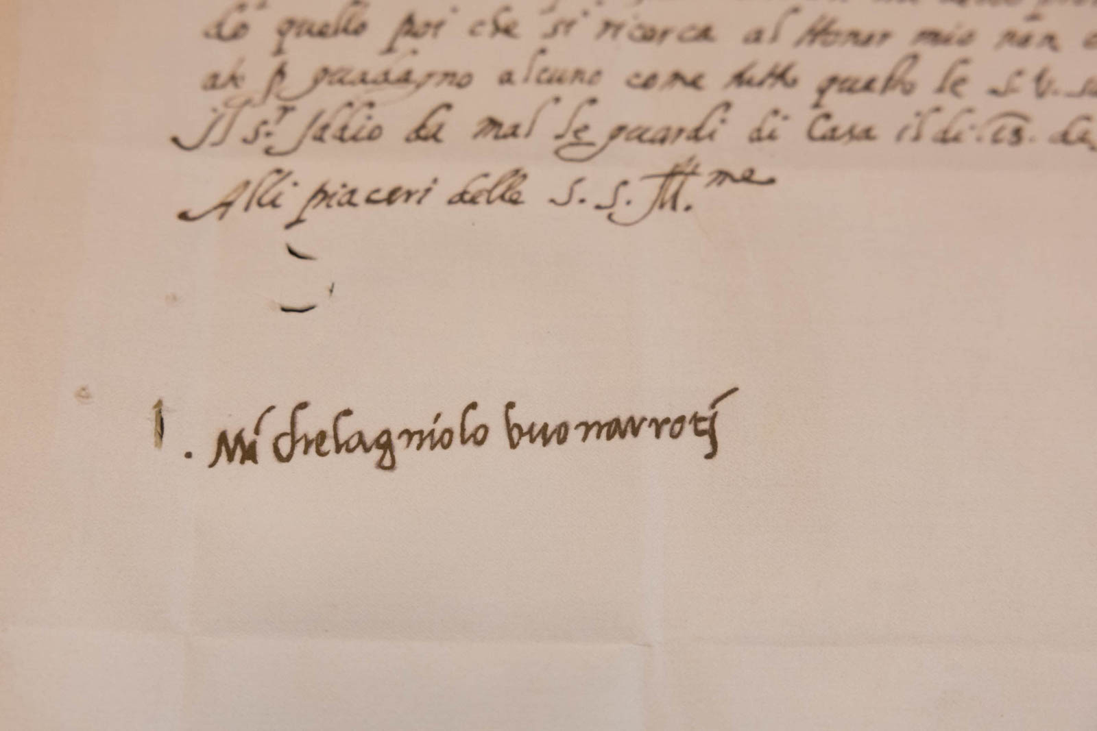
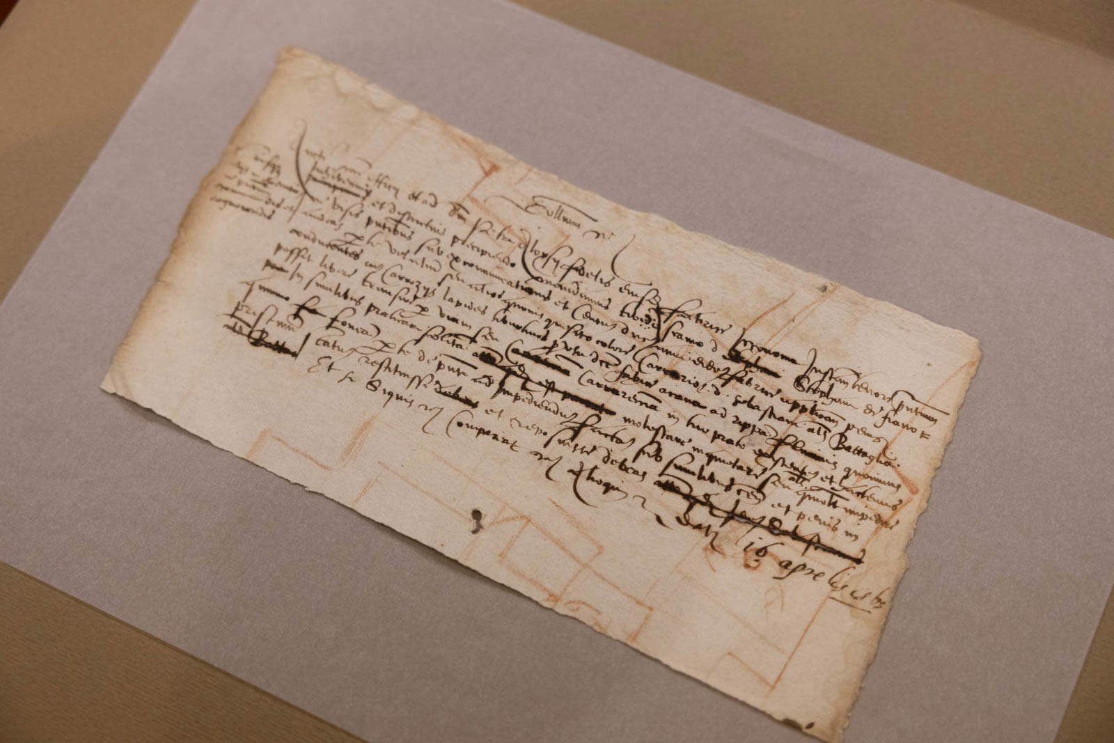
To reconstruct the distinctive features of the artist’s handwriting, the studiogusto® team examined original documents preserved in the archives of the Fabbrica di San Pietro,the Vatican Apostolic Archives, and at Casa Buonarroti in Florence. Letters, notes, and signatures provided valuable insights into Michelangelo’s most personal side. In particular, the signature served as a significant starting point: a synthesis of gestures, formal choices, and individual characteristics, capable of revealing certain aspects of its author’s personality. The investigation revealed recurring elements in the construction of capital letters, the proportions of the shapes, the terminations of the strokes, and the consistency of the slants. Particular attention was also paid to the organization of negative space—that is, the empty areas surrounding and separating the letters. This is a less immediately apparent aspect, yet one that is essential for understanding the overall balance of the handwriting. The research thus brought to light a sort of invisible architecture in Michelangelo’s handwriting: an internal structure capable of uniting expressiveness and rigor. This principle became one of the foundations of the new typeface, in which typographic consistency does not negate the vitality of the mark but allows for a new interpretation of it.
One of the most interesting aspects of Michelangelus is the dialogue between the two dimensions of Michelangelo’s work: the intimate dimension, reflected in his everyday handwriting, and the monumental dimension, represented by his artistic and architectural masterpieces.
The lowercase letters are primarily influenced by the study of letters, notes, and signatures, from which the most personal character of the handwriting emerges. The uppercase letters, on the other hand, evoke the formal power of his great works, from the Pietà to the dome of St. Peter’s. The project thus connects the artist’s private voice with his public presence, constructing a typographic system that unites the human dimension with monumental ambition. The transformation of his handwriting into a typeface intended for everyday use also requires a balance between expressiveness and legibility. A curious testament to just how important legibility was to Michelangelo comes from his family correspondence. The artist frequently wrote to his nephew Lionardo Buonarroti, but the latter’s handwriting caused him no small amount of difficulty. In one letter, exasperated by the effort required to decipher his messages, he went so far as to rebuke him with particularly harsh words: “Don’t write to me anymore: every time a letter from you arrives, I get a fever from the effort it takes to read it!” The ironic and irritated tone of this episode reminds us that even a great Renaissance master had to grapple with a very practical problem: making his writing legible to his readers.
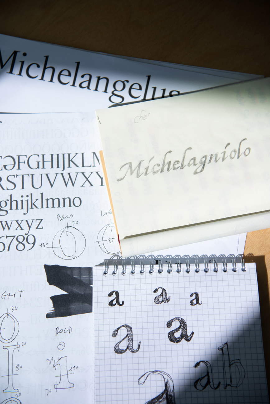
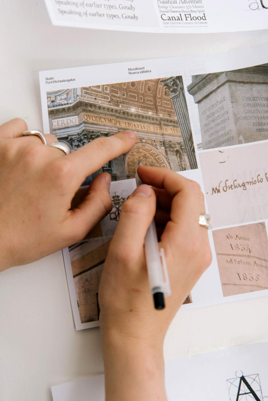
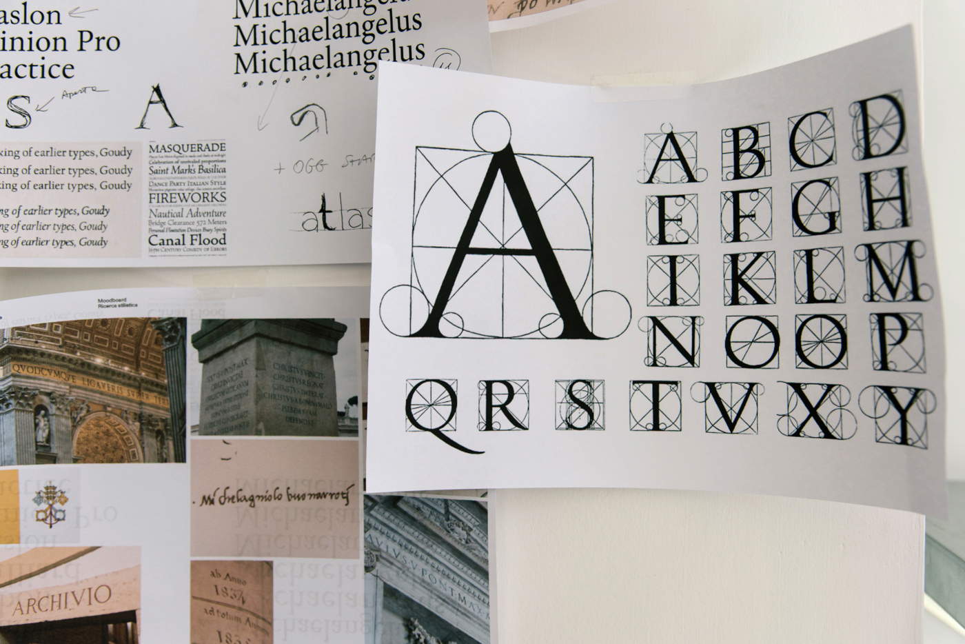
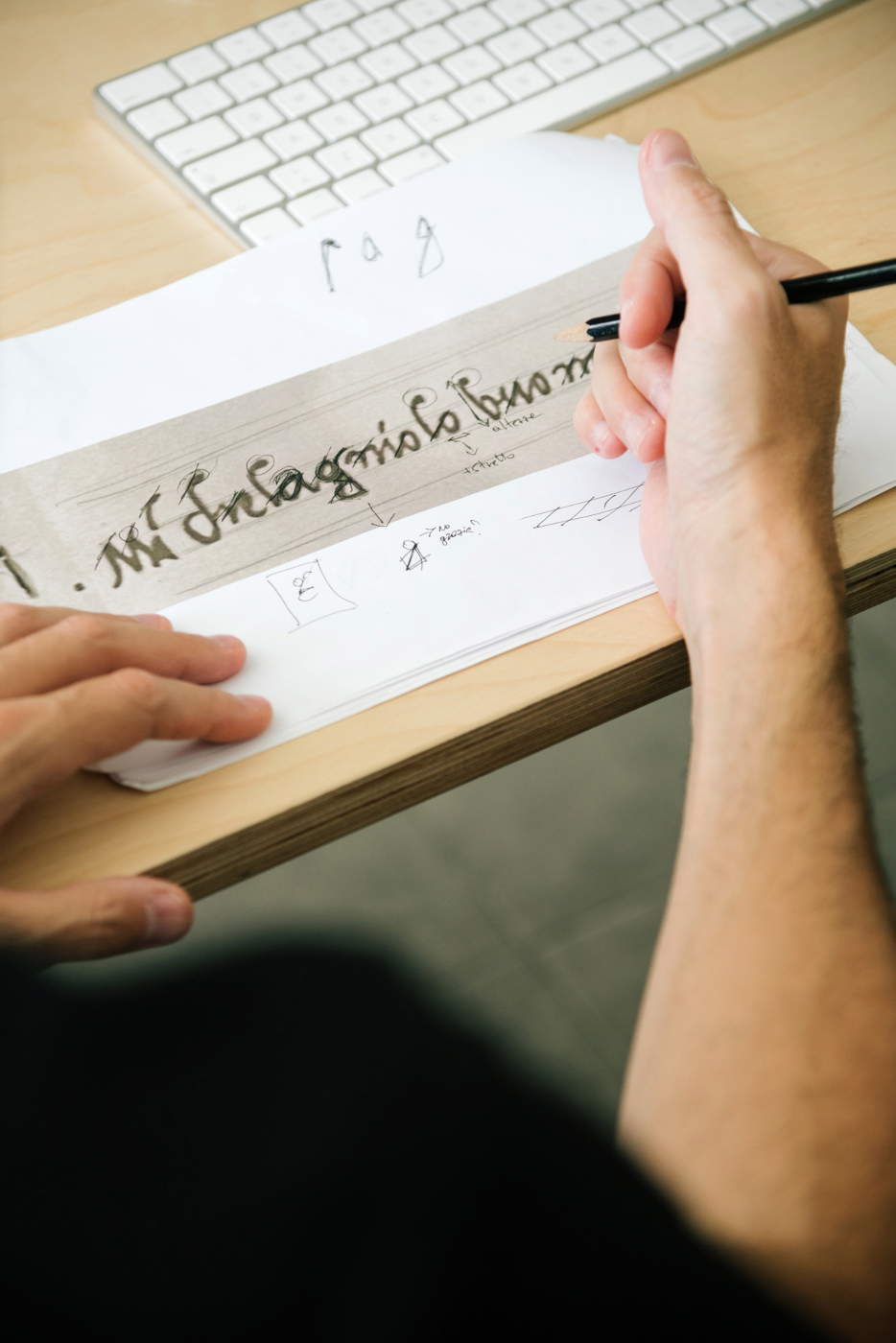
After a meticulous process of design, testing, and refinement, Michelangelus was developed as a complete typeface family, designed to work across various contexts, from print to digital applications.
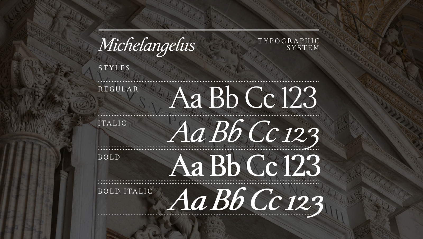
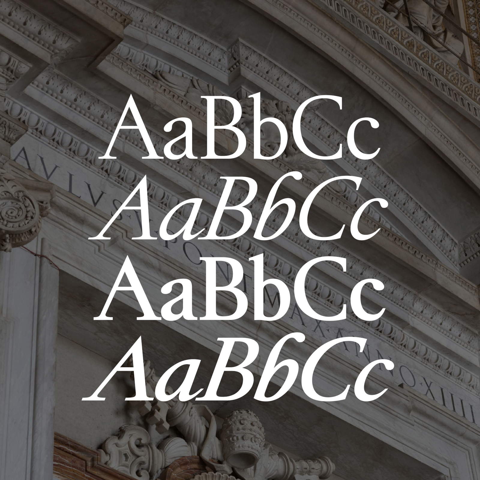
The typeface includes over 500 glyphs and four styles: Regular, for general use; Italic, for italicized text and highlighting; Bold, for headlines and emphasized elements; and Bold Italic, which combines italics with bold. The family was designed to meet the technical requirements of digital applications and to integrate into the Microsoft 365 Office ecosystem. It is also available for direct download, so that users and organizations can install and use it for free worldwide.
Free access is accompanied by a licensing model designed to protect the font’s integrity and regulate its distribution. The initiative thus combines openness with cultural promotion, allowing a historic typeface to become part of contemporary communication tools.
Michelangelus is part of a broader program of digital initiatives entrusted to Microsoft by the Fabbrica di San Pietro to promote and enhance its cultural heritage. The project demonstrates how technology can offer new possibilities for interpreting and disseminating historical memory. Michelangelo’s handwriting, which originated in a context completely different from that of digital communication, becomes a language that can be used in the present without losing its connection to its origins. Through research on the original documents and the translation of their distinctive elements into a coherent typographic system, Michelangelus builds a bridge between the past and the future. A novel way to engage with Michelangelo—not only through his sculptures and architecture, but also through the everyday gesture of his hand, now reinterpreted in a form accessible to everyone.
|
| Michelangelo's handwriting becomes a font: Michelangelus is born, free for everyone |

Warning: the translation into English of the original Italian article was created using automatic tools. We undertake to review all articles, but we do not guarantee the total absence of inaccuracies in the translation due to the program. You can find the original by clicking on the ITA button. If you find any mistake,please contact us.























 IT
IT FR
FR DE
DE ES
ES CN
CN