A bright, shiny red, a “Valentine red,” is certainly the hallmark of the Valentine typewriter, designed in 1968 by Ettore Sottsass jr (Innsbruck, 1917 - Milan, 2007) and Perry King (London, 1938 - 2020) and produced by Olivetti in 1969. By this date, the partnership between Sottsass and Olivetti had been underway for several years and was more solid than ever; for Olivetti Sottsass had already designed not only several typewriter models but also the aesthetic and ergonomic apparatus of the Elea 9003 electronic calculator (Compasso d’Oro in 1959), one of the first calculators produced in Italy and in the world. King, on the other hand, has been a consultant for the company for a few years, that is, since his arrival in Italy in 1964, and will remain linked to Olivetti with the role of corporate image coordinator, designing typefaces for the machines produced by the company and creating catalogs, books and posters.
Olivetti, a company founded in Ivrea in 1913 by engineer Camillo Olivetti, began precisely as a manufacturer of typewriters, and was able to achieve widespread popularity in world markets with Adriano Olivetti, Camillo’s son, who led the company until 1960. In companies, offices, banks, and businesses, one finds not only typewriters, but also Olivetti calculators and invoicing machines. This period also saw the expansion of the Olivetti Complex in Ivrea, with three new extensions designed by Luigi Figini and Gino Pollini, and the Pozzuoli plant, designed by Luigi Cosenza, was built. They represent the philosophy with which Adriano Olivetti approached the relationship between man and the workplace; in fact, he declared during the inauguration of the Pozzuoli plant in 1955, “in front of the most singular gulf in the world, this factory was elevated, in the architect’s idea, in respect for the beauty of the places and so that beauty would be a comfort in the work of every day. [...] The factory was thus conceived to the measure of man, so that he might find in his orderly workplace an instrument of redemption and not a device of suffering.”
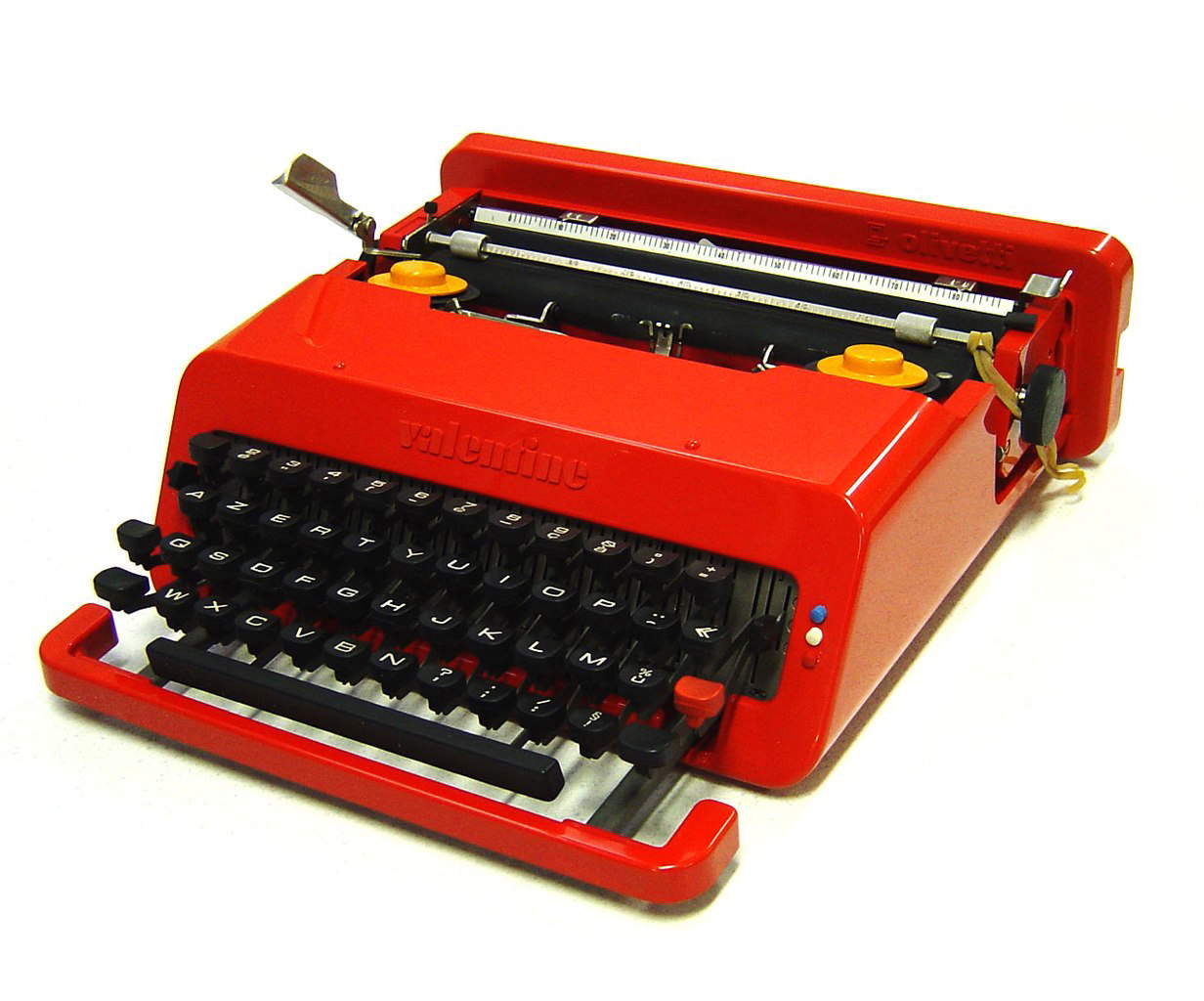
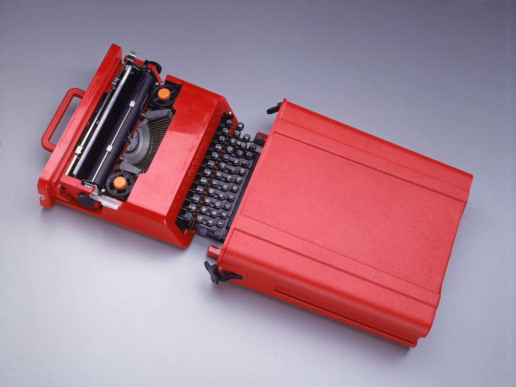
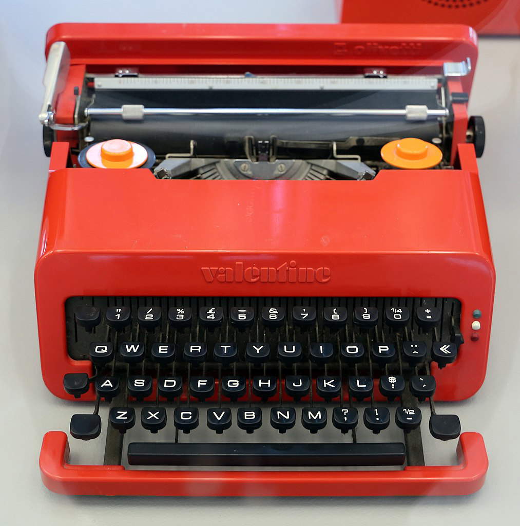
Between the 1960s and 1970s, when Sottsass and King were working on the Valentine project, the typewriter market was rapidly changing, was close to saturation, and the level of competition from foreign companies was very high. Sottsass himself recalls that the development of Japanese technologies that arrived on the European market in the form of portable machines worried the company, which tries to “run for cover.” The challenge set by Olivetti is to create a portable typewriter with mechanical technology at a low price. Sottsass therefore works on extreme simplification: he avoids upper and lower case letters, envisaging only uppercase characters as in telegrams, and designs a body made of a very cheap plastic material, moplen, to make it “the ballpoint pen of portable typewriters.” Olivetti did not accept this first version, as it was too simple and not in keeping with the company’s image; so the plastic was changed and replaced with ABS, which was more solid and “precious,” and upper and lower case letters were restored.
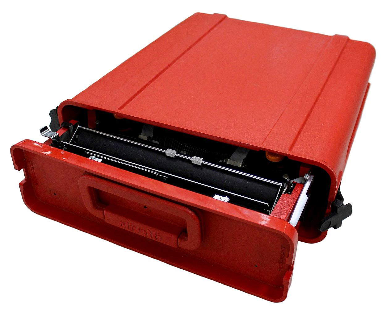
In a break with the historic Lettera 22 designed by Marcello Nizzoli, the Valentine features a flamboyant red body, except for the keyboard, which is black in color and stands out sharply from the body of the machine and differs in contrast. Thanks to a handle on the back, the Valentine can be stored in its own case, also red, becoming an integral part of the machine and can be carried like a briefcase. This pop-flavored machine is envisioned as an object suitable for everyone, not just professionals; a typewriter that would find a place in homes and not just offices, and that could also be sold “at the local market,” as Sottsass himself stated in a 1999 interview on the Rai program “Lezioni di design.”
However, sales did not go as one would have expected, and it is the author himself who claims that Valentine’s was a real failure from the point of view of sales and market diffusion. Nevertheless, what helps to give the Valentine popularity is the extraordinary advertising campaign coordinated by Sottsass. Precisely because it was conceived as a popular and accessible object, the Valentine is told through advertisements and posters with a playful tone, which appeal to a young audience, showing the car inserted, even in commercials, in the most diverse contexts: at the park, at the bar, at the airport, in the snow, around the world. The posters do not report so much on the technical features of the product, but focus on its global, strong and transgressive image, on the ease of transport that allows it to be taken anywhere, stowed in its briefcase, and on that “Valentine red” that makes it different from previous models. The creation of this “breakthrough” campaign, which has remained iconic, sees the help of big names in graphic design, such as Milton Glaser and Valter Ballmer, who contribute to its success. It is no coincidence that years later, in 1988, production is restarted in Mexico at the request of users who see the Valentine as a cult object, a design piece for enthusiasts to absolutely have in their collection. At the same time, the Valentine entered the permanent collections of museums such as MoMa and the MET in New York. This shows that, as Sottsass himself argued, “good or bad this red object, quite aggressive and popular, becomes a bit of a catalyst for actions and movements.”
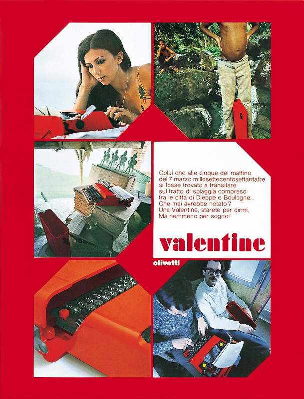
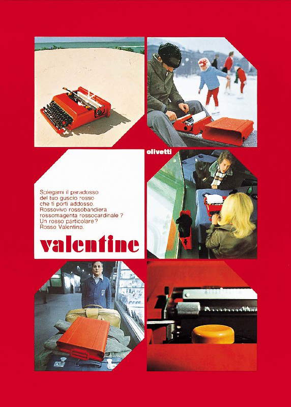
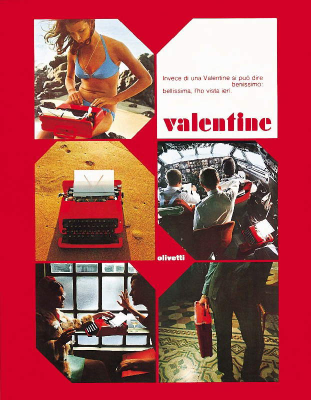
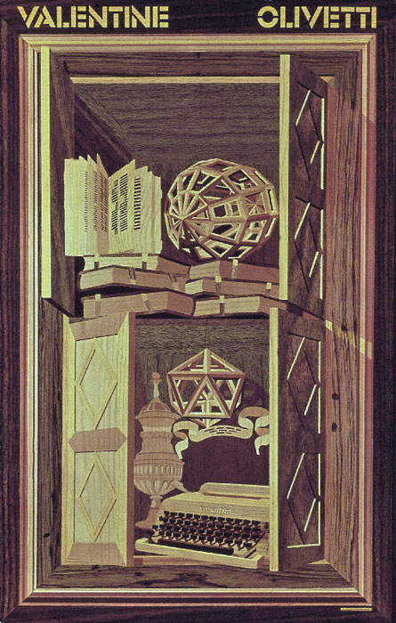
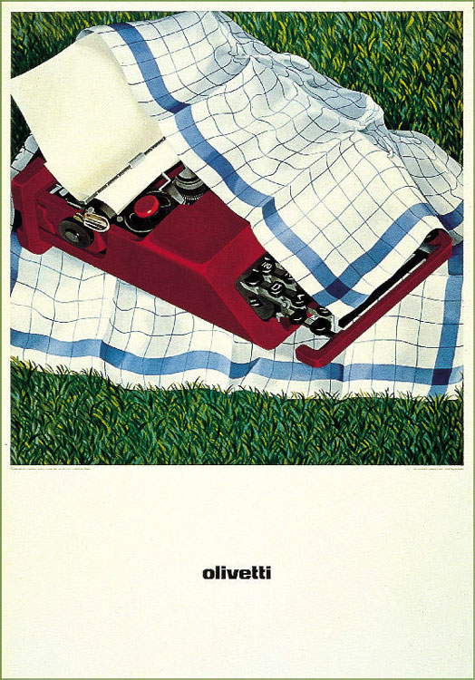
With respect to the advertising campaign, Sottsass says, “there is still to be said that perhaps all the graphics with which we announced the Valentine, is not perfect: perhaps it deviates a lot from the old, famous, fabulous, classic Olivetti approach, but I hope we will be forgiven for presumption-which is certainly not irreverence-for attempting an openness to the new times and also to the new program structure of the industry that faces larger responsibilities and more conscious societies every day. Perhaps we can continue to do less and less worse things if luck is with us. And then I feel it is important to say that Albert Leclerc and Perry King also helped me to design this object.”
Sottsass’s openness to the new and to the needs of a new society, in which the Valentine is not a positional commodity, but “everyone’s laptop,” say much about Sottsass’s conception of design: a design that is a reflection on society itself and that will lead him to the “radical” turn and adherence to Radical design or Counter Design. He, in fact, in the catalog of the 1983 exhibition at the Philadelphia Museum of Art, entitled Design since 1945, writes that “the so-called Counter Design movement supports the idea that design does not end with the object put into production by industry, but begins when it enters our homes, our streets, cities, skies, bodies, souls. Design begins when it becomes a visual, physical, sensory representation of the existential metaphor on which we ground our lives.” Design that is not an end in itself, but is a tool for knowledge, social critique, subversion of rules and experimentalism, “a way of discussing life [...] a way of discussing society, politics, eroticism, food, and even design,” which begins to take shape precisely through objects like the Valentine typewriter and will lead to incredible developments.
Warning: the translation into English of the original Italian article was created using automatic tools. We undertake to review all articles, but we do not guarantee the total absence of inaccuracies in the translation due to the program. You can find the original by clicking on the ITA button. If you find any mistake,please contact us.