

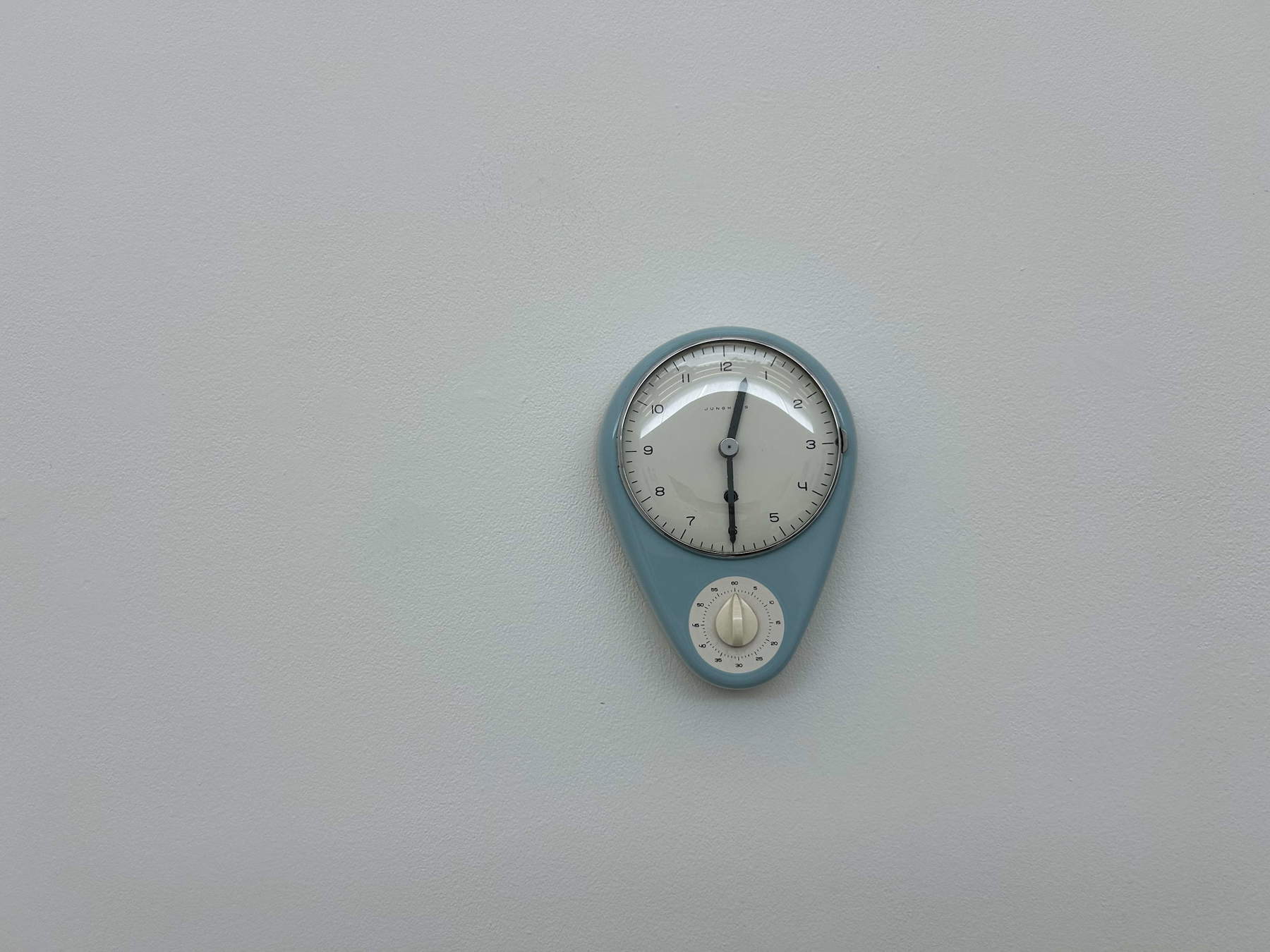
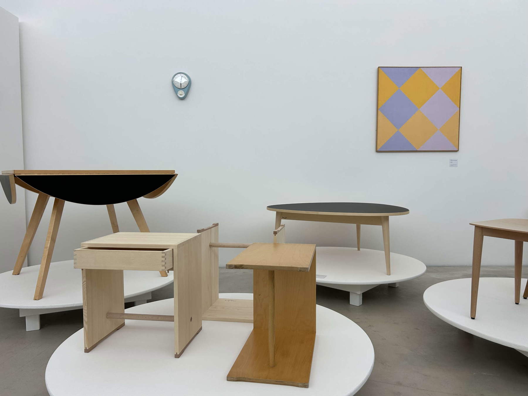
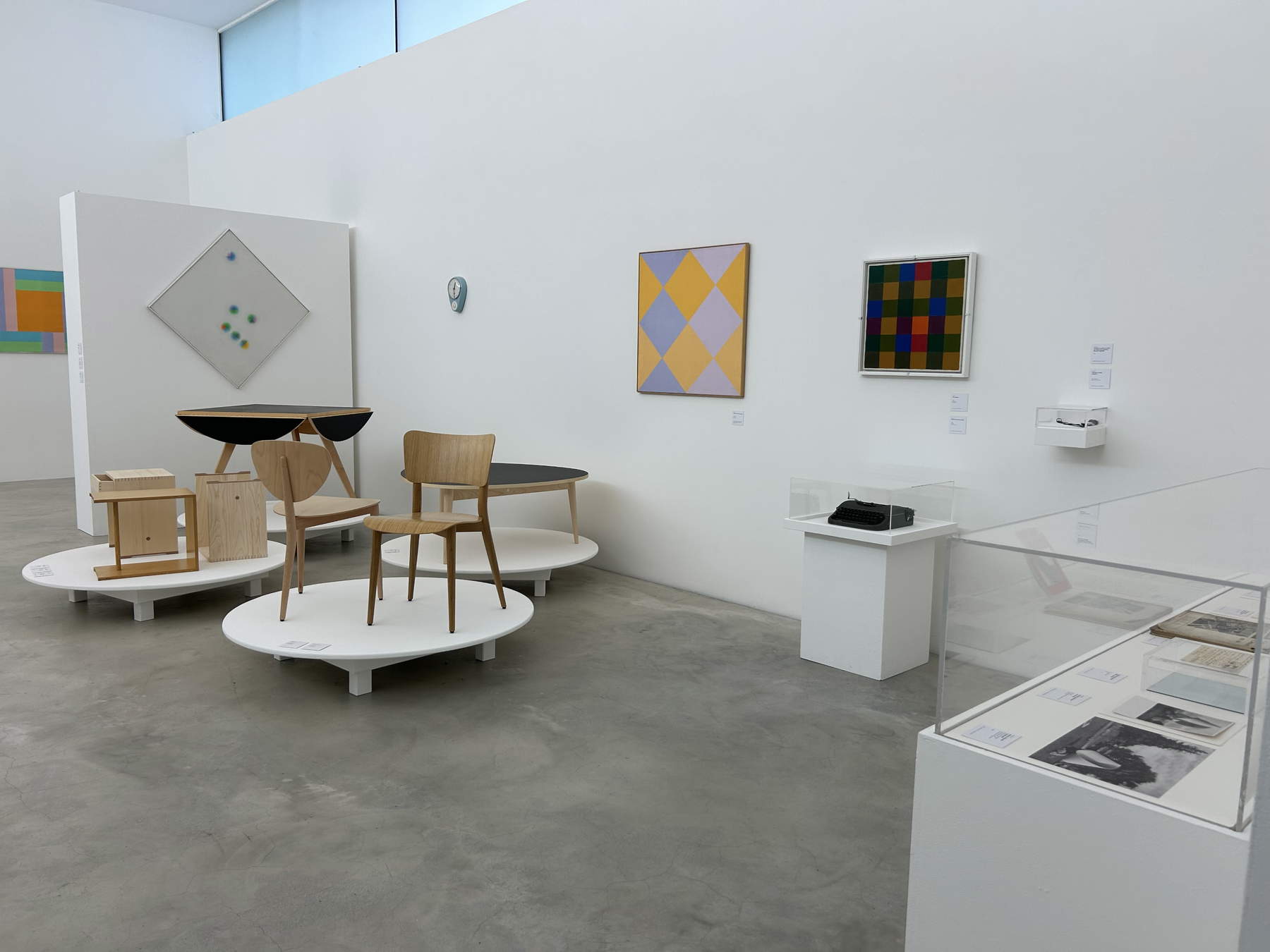
There is a small blue timer hanging on the wall in one of the last rooms of the exhibition that the m.a.x. museum in Chiasso is dedicating to Max Bill, and perhaps it is necessary to start from here, from an object that is domestic and almost meek in its prominence, with the clock face above and the minute knob below, because in that teardrop shape, in that clear plastic that seems to be made to disappear inside a kitchen, it is immediately clear that for Bill the form was a way of disciplining time and bringing it from the indistinct mass of duration to the precision of a gesture. A timer, after all, serves little purpose, at least according to the pompous hierarchy with which we continue to separate important works from the things that are used and forgotten beside a stove. Bill, on the other hand, belies this comfort: in him, form moves from painting to chair, from book cover to sculpture, from exhibition pavilion to surface, from architecture to the knob of a timer, and each time he retains the same demand for necessity, the same confidence in a beauty capable of arising from function and, because of its exactness, of taking on a function of its own.
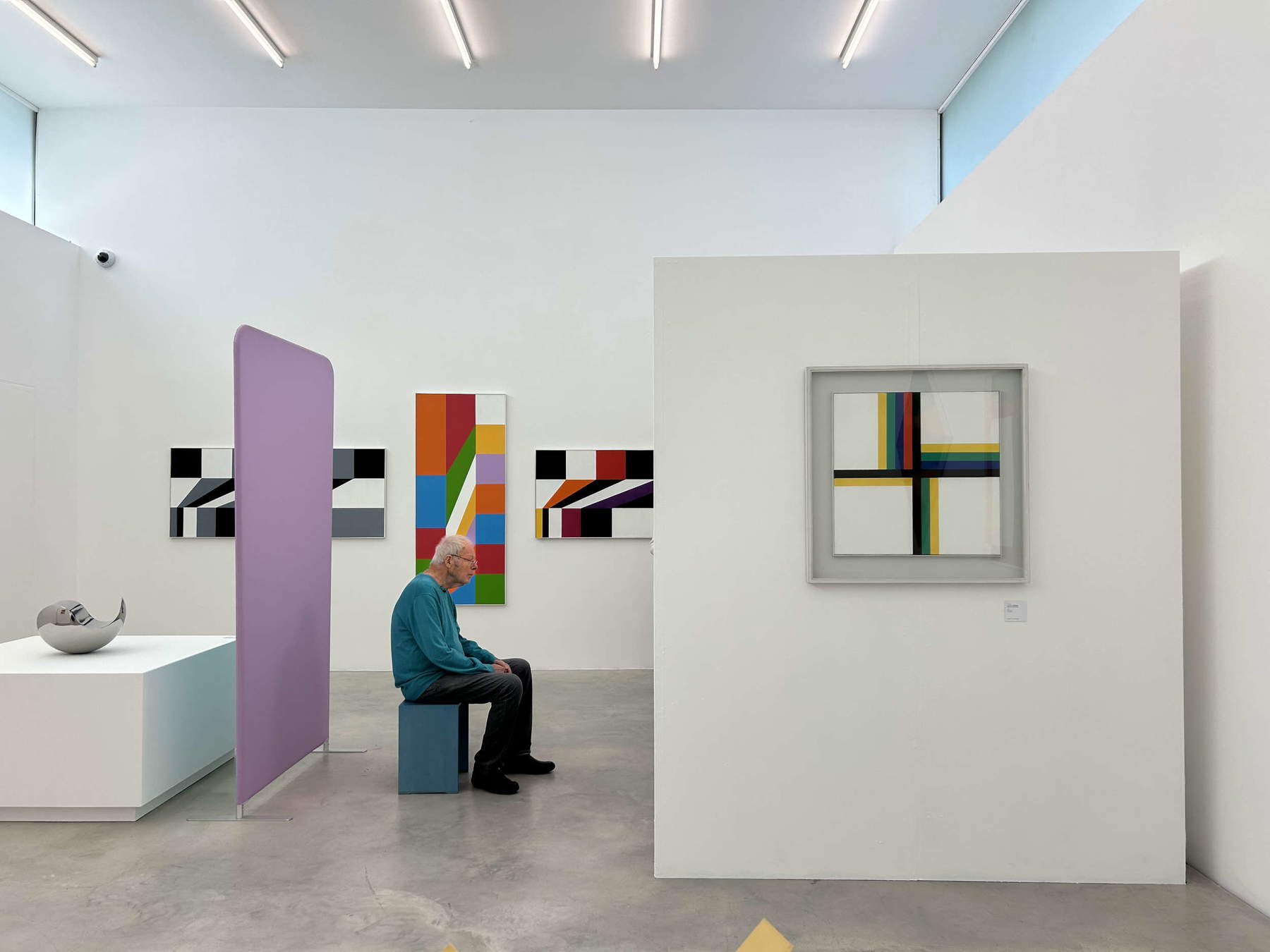
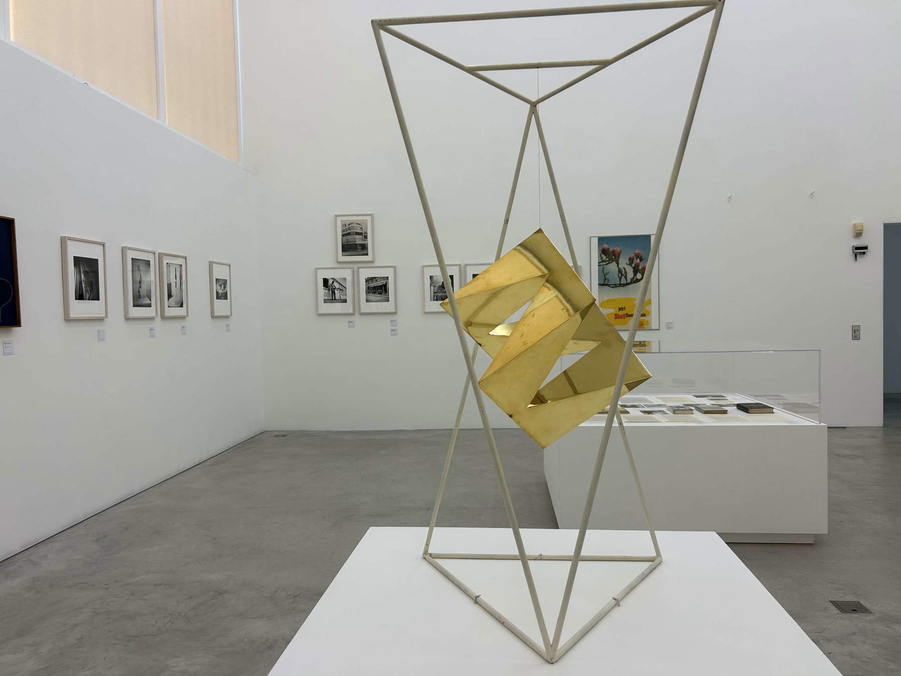
The Chiasso exhibition Max Bill (1908-1994): the grammar of beauty, which can be visited until July 7, 2026, has the merit of removing him from the most consummate formula: that of the geometric artist, the man of measurement and the designer who would transform the world into a system of numerical ratios. In fact, the geometry so beloved by the artist is only one of the languages through which thought is condensed into visible form; rather, his work appears as a field where concrete art, modernist architecture, editorial graphics, object of use, industrial design, theoretical writing and exhibition design proceed within a rigorous continuity, as if every surface is brought back to a clear, but never inert, order. The exhibition itinerary tells this diligently as it proceeds by overlapping surfaces: on one side, the Bauhaus student’s ID card, small, worn, with Bill’s young face behind his glasses; next to it, images of his 1928 lodgings, Comologno photographs, letters, Aline Valangin’s volumes, covers for Silone, documents related to Abstract and Concrete Art; on the other, on the walls, lithographic variations, large color fields, harder compositions, sculptures that twist metal or suspend planes in space.
After studying at the Kunstgewerbeschule in Zurich, Bill attended the Bauhaus between 1927 and 1928, taking different courses and workshops, from the metal of painter and photographer László Moholy-Nagy to classes by Josef Albers, Oskar Schlemmer, Kandinsky and Klee. Here the materials of the retrospective also remind us, thanks to the archival research recalled by curators Karin Gimmi and Nicoletta Ossanna Cavadini, of the need to correct a persistent vulgate: Bill stays at the revolutionary art school for three semesters, a fact reconstructed through the documentation kept by the family. It is an apparently administrative detail, yet it counts enormously, since it gives back to the Bauhaus its real nature, that of a very intense and open attendance, made of workshops, teachers, techniques and meetings, far from the scholastic idea of a linear education. In that context Bill absorbs a decisive lesson, namely that art can enter the construction of the environment, form can inhabit objects, design can become an integral discipline and visual thinking can cross the traditional thresholds between painting, sculpture, architecture and design.
Yet before the full establishment of concrete art, Bill appears more porous, more restless, traversed by figurative suggestions, Italian landscapes, faces, and images in which the line seems to seek a balance between observation and construction. The self-portrait of 1926, with the face lit up by feverish greens and reds, possesses an extremely harsh intensity; the watercolor of Naples, also dated 1926, holds the outline of the landscape and the coast within a chromatic synthesis still linked to the experience of travel; the small Frauenkopf of 1925, severe and compact, preserves the memory of a plastic training that precedes full abstraction. Even Tanzendes Mädchen, the large female figure of 1928 close to Klee’s universe, with the body broken up into backgrounds, the frontal eye, the raised hand, the parched, textured gold background, shows a less pacified Bill than is often told, a Bill who goes through the figure before arriving at its radical purification. Here the form still has skin, then contracts. Then it changes temperature.
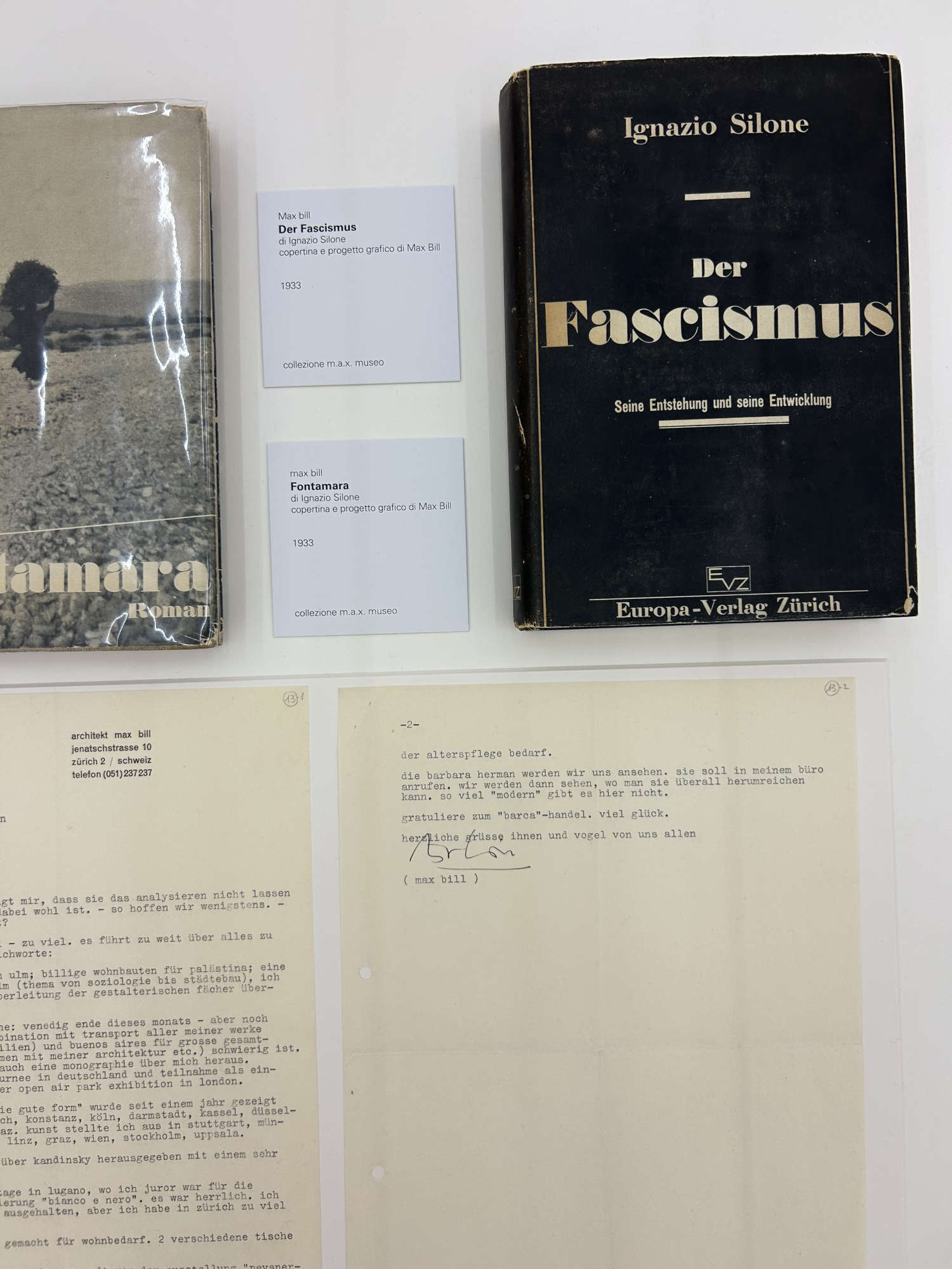
The relationship with Italy, in this trajectory, takes on a much deeper weight than a simple geography of travel. The materials in the exhibition recall Italian sojourns in the 1920s and 1931, with stops in Genoa, Rome, Naples, Florence, Venice, Milan, Salerno, Positano, Paestum and Agrigento, and underscore his interest in the majesty and volumes of Roman and Greek ruins. But Bill’s Italy is also Milan, the Triennale, the postwar period, reconstruction, industrial design, graphics, the network of architects and intellectuals forced to Switzerland by racial laws and political persecution. It is an Italy experienced through form and through history, and for this reason, the presence of the covers for Silone, Fontamara and Der Fascismus, from 1933, reveal a weight that exceeds pure graphic interest. Bill designs covers in which the image is reduced to a sharp, frontal typographic tension, with a blackness that weighs as much as political matter and a composition that avoids any illustrative indulgence. Graphics, here, become an editorial responsibility by giving face to a thought, organizing its entry into the world, and making it readable but never sweetened.
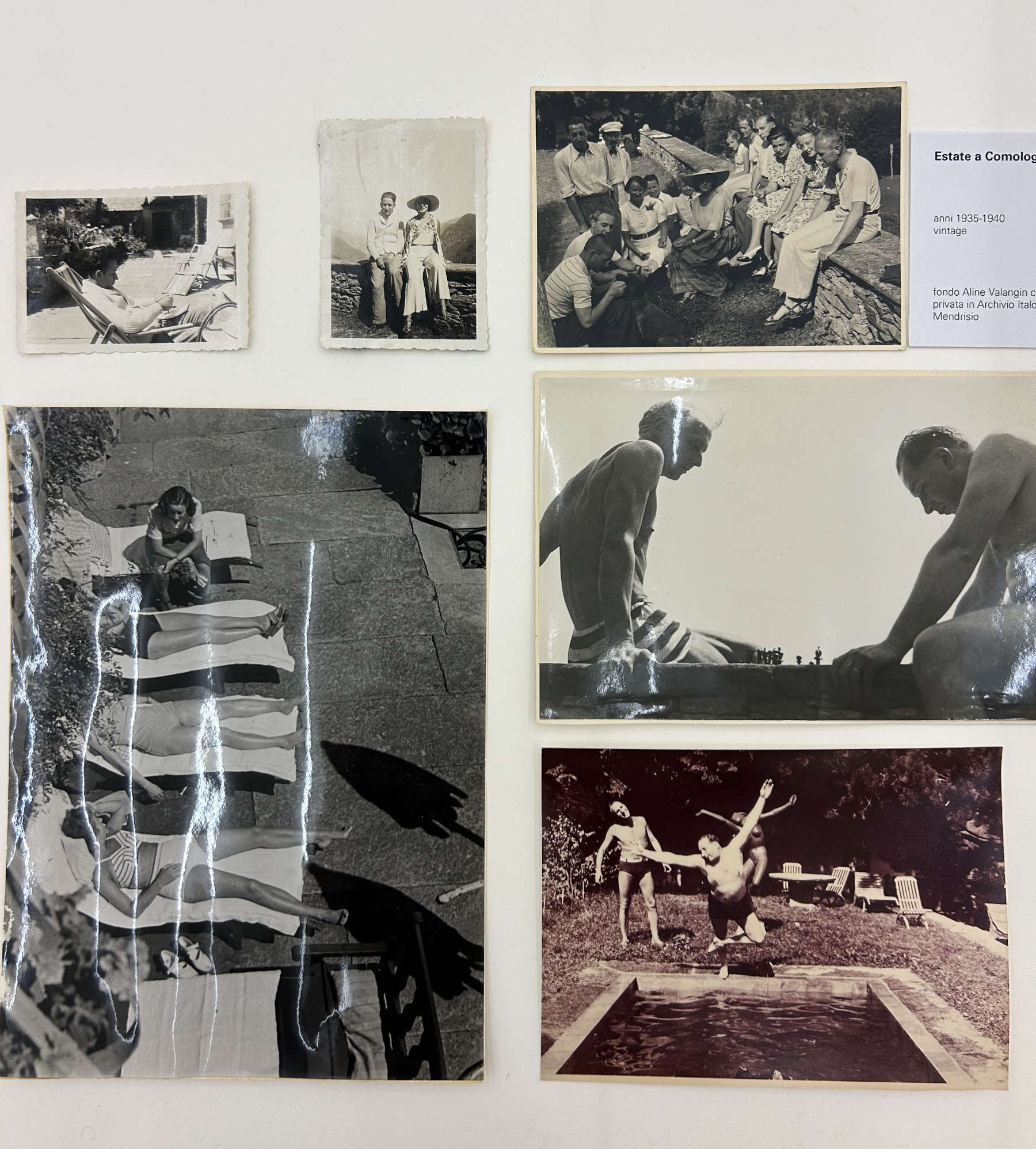
Moreover, the photographs of the 1930s and 1940s, with bodies lying in the sun, figures gathered around a table or lawn, men and women posing by the pool, do not tell of an elegant vacation, at least not only. Behind those seemingly light images, behind the summer, the chairs, the sharp shadows, the light-colored clothes, one glimpses Villa La Barca of the Rosenbaum family. It was a place of antifascist cultural exchange. Wladimir Rosenbaum, a lawyer born in Minsk in 1894 and who came to Switzerland as a child after his family fled the Russian pogroms, is an irregular and central figure in Ticino culture: jurist, man of relations, then antiquarian and art dealer, capable of holding law, politics, avant-garde and collecting together; Aline Valangin, pianist, writer and psychoanalyst, after training also linked to Jungian circles, was with him at the center of a Zurich salon open to the avant-garde and then of intellectual life in Comologno. Villa La Barca, purchased by the couple in 1929 in the Onsernone Valley, thus became a meeting place for artists, writers and persecuted fugitives, traversed by, among others, Ignazio Silone, Elias Canetti, Max Ernst, Meret Oppenheim and Max Bill himself. A house-laboratory of European modernity, where conversations, friendships and letters let emerge a shared reflection on beauty, color, space and movement. From such a perspective I think it is interesting to note how Bill does not mature within a geometric tower, but within a network of houses, books, papers, escapes, refuges and incessant crossings. His form also arises in response to an unstable Europe, wounded by propaganda, exiles, and necessary reconstructions; and precisely because of this, his formal order appears clearer when viewed against the disorder of historical time.
In 1936 Bill was twenty-eight years old and set up the Swiss section at the 6th Milan Triennale. It is an important step not only because it allows him to measure for the first time, within an architectural space, the principles of concrete design, but because that experiment takes place in a politically charged context; in Fascist Italy, within an exhibition event in which even the layout could easily become a language of national representation, an ordered and seductive image of a collective identity to be delivered to the public gaze. The Swiss section, located near the entrance, could not therefore be a neutral space, and Bill resolves this by avoiding both the reassuring folklore with which Switzerland was often told abroad and the monumental and celebratory emphasis that ran through much of the exhibition culture of those years. In lieu of the sweetened and reassuring image of the Alpine country, he constructs a modern environment in which ceramics, jewelry, vases, clocks, watches, textiles, art books and graphic works are ordered within a coherent visual structure made up of totems, vitrines, panels, suspended elements, a reading room with a small table designed by Bill himself, and a giant picture of the Engadine Alps composed of thirty photographs. It is in this sense that formal rigor also becomes a distancing: Bill does not oppose propaganda with an explicit counter-manifesto, but with another way of constructing space, based on the reduction of emphasis. The architect Mario Labò, in issue 159-160 of “Casabella” in 1941, grasped precisely this deviation when he saw in the layout the replacement of the old alpine and artisanal folklore of the Swiss exhibitions with a geometric rigor of forms; years later “Domus” would recall that section as a bold and controversial presence, capable of influencing several subsequent Italian layouts. Bill himself called it an application, in relation to the new architecture, of notions coming from painting and constructive sculpture: an exhibition, therefore, that did not merely contain objects, but transformed the exhibition itself into a designed organism.
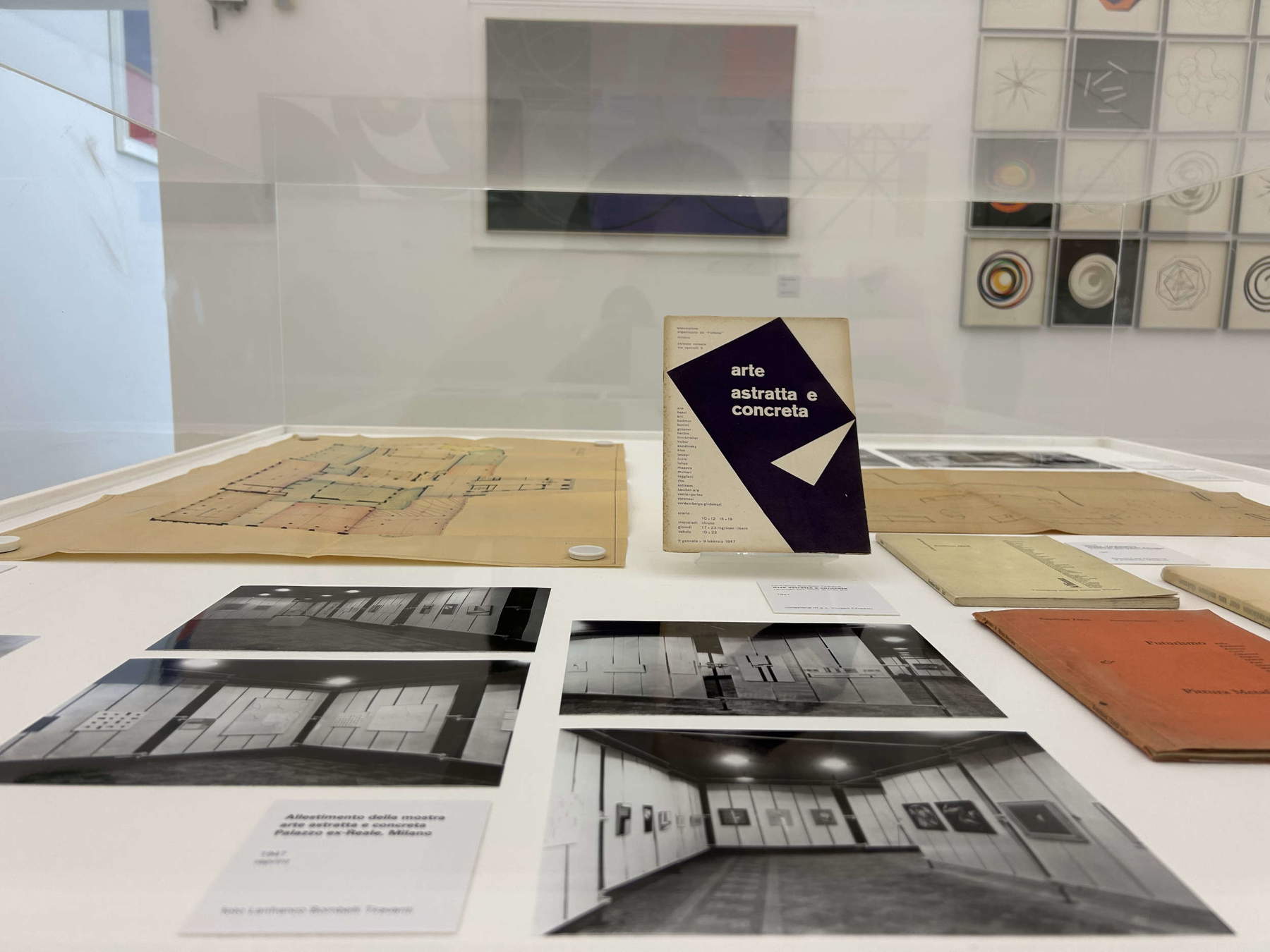
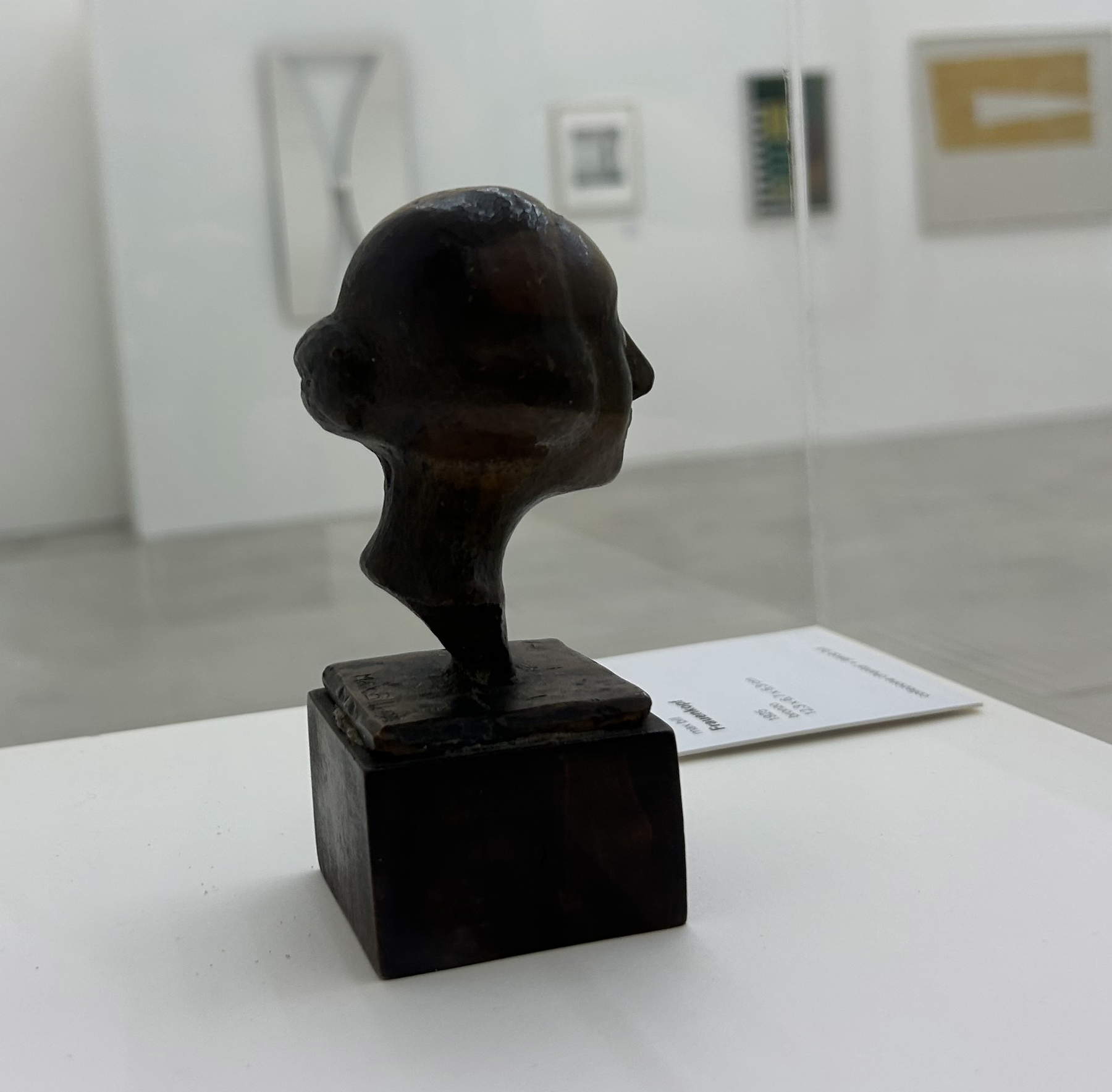
The same idea returned in 1947, when Abstract and Concrete Art was presented at the Palazzo Reale in Milan, from January 11 to February 9, in a city still wounded by the war and forced to rethink not only its buildings but also its cultural forms. The exhibition, born around the work of Lanfranco Bombelli Tiravanti and the connection with Bill and Max Huber, becomes one of the moments when concrete art finds a sharper and more conscious visibility in Italy. The Swiss artist participates in the very construction of the project, contributing to the relations with the international area and inserting himself in a plot that unites Kandinsky, Klee, Herbin, Vantongerloo, Vordemberge-Gildewart and the Italians Licini, Munari, Radice, Rho, Sottsass and Veronesi. His presence, with thirteen works and with Kontinuität, a gilded copper sculpture founded on the relationship between concave and convex, indicates well the point of the question: concrete art, for Bill, is not a reduction of the visible to geometry, but the construction of an autonomous reality, capable of existing through relationships, surfaces, volumes and continuous tensions. Dorfles, writing in “Domus,” recognized in that review the passage from the abstract to the concrete, that is, the possibility of giving objective body to an abstract ideal, and identified precisely in Bill’s sculpture one of the most representative presences of that season.
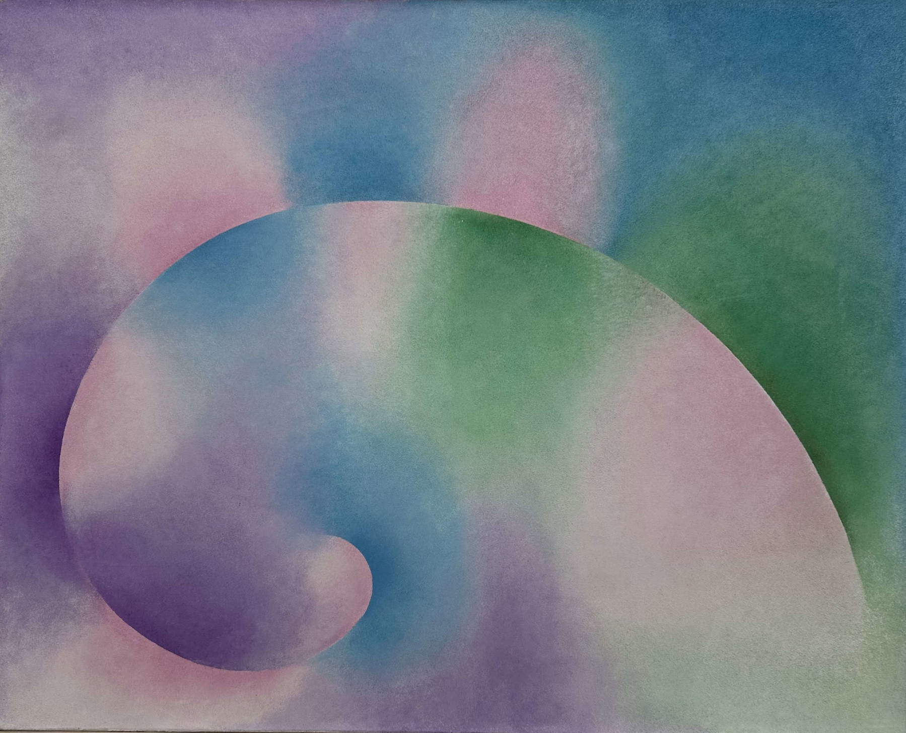
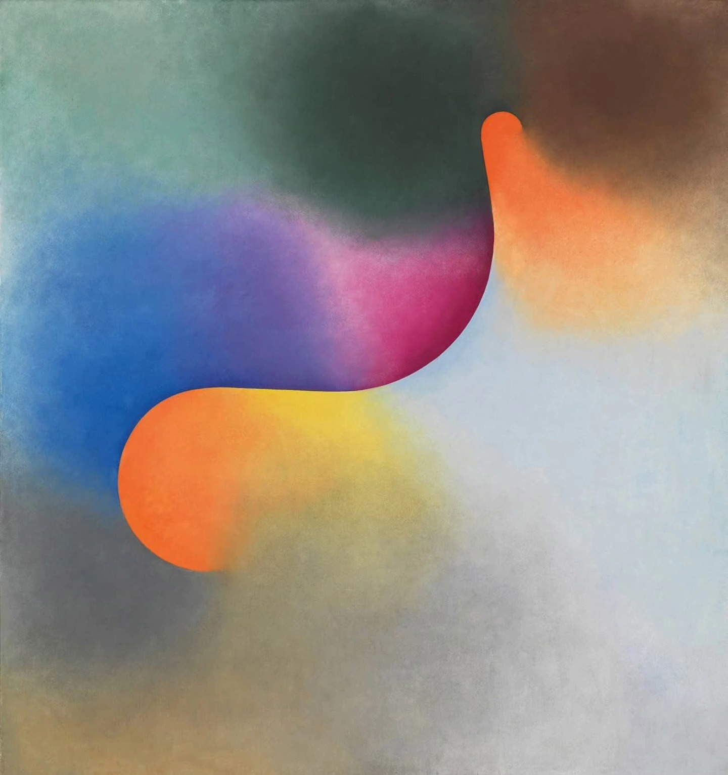
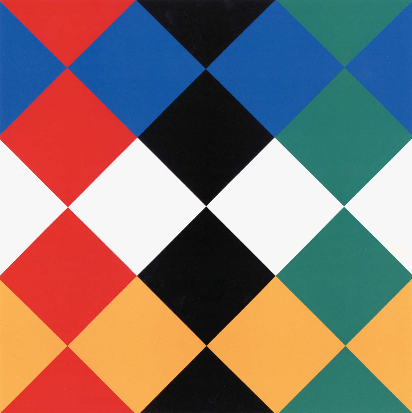
It is precisely here that the word “concrete” must be freed from what could quickly become his laziest misunderstanding. He distinguishes, in fact, abstract art from concrete art through an essential example: a red dot on a white background can be a sunrise in the fog, thus an image abstracted from a natural subject, or it can be a red dot that expresses its artistic reality only in its relationship to the surface; in the second case it is the concretion of an abstract thought, thus concrete art. The difference seems minimal, and instead on the one hand the world remains as a memory, and on the other an autonomous visual reality is born.
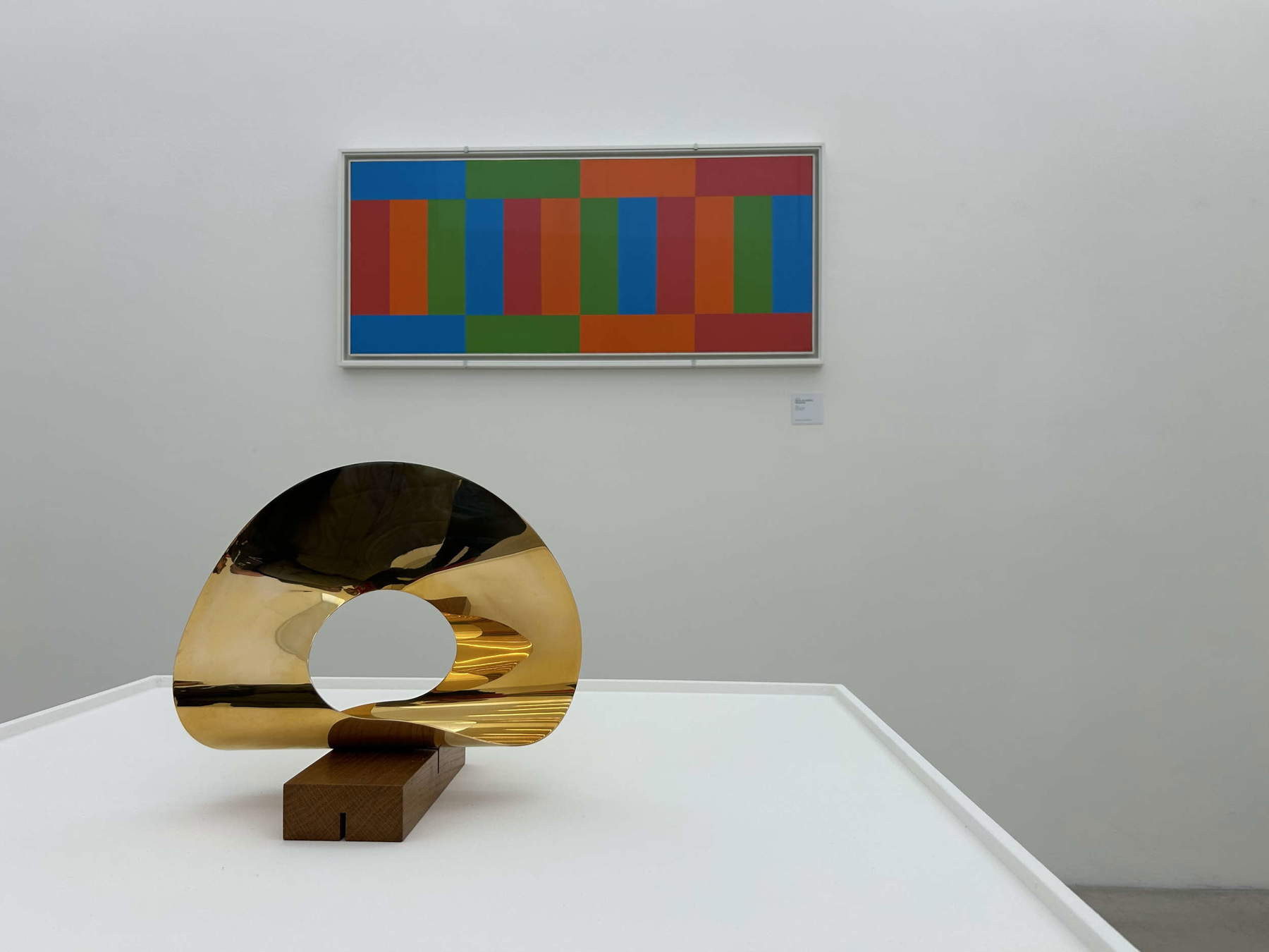
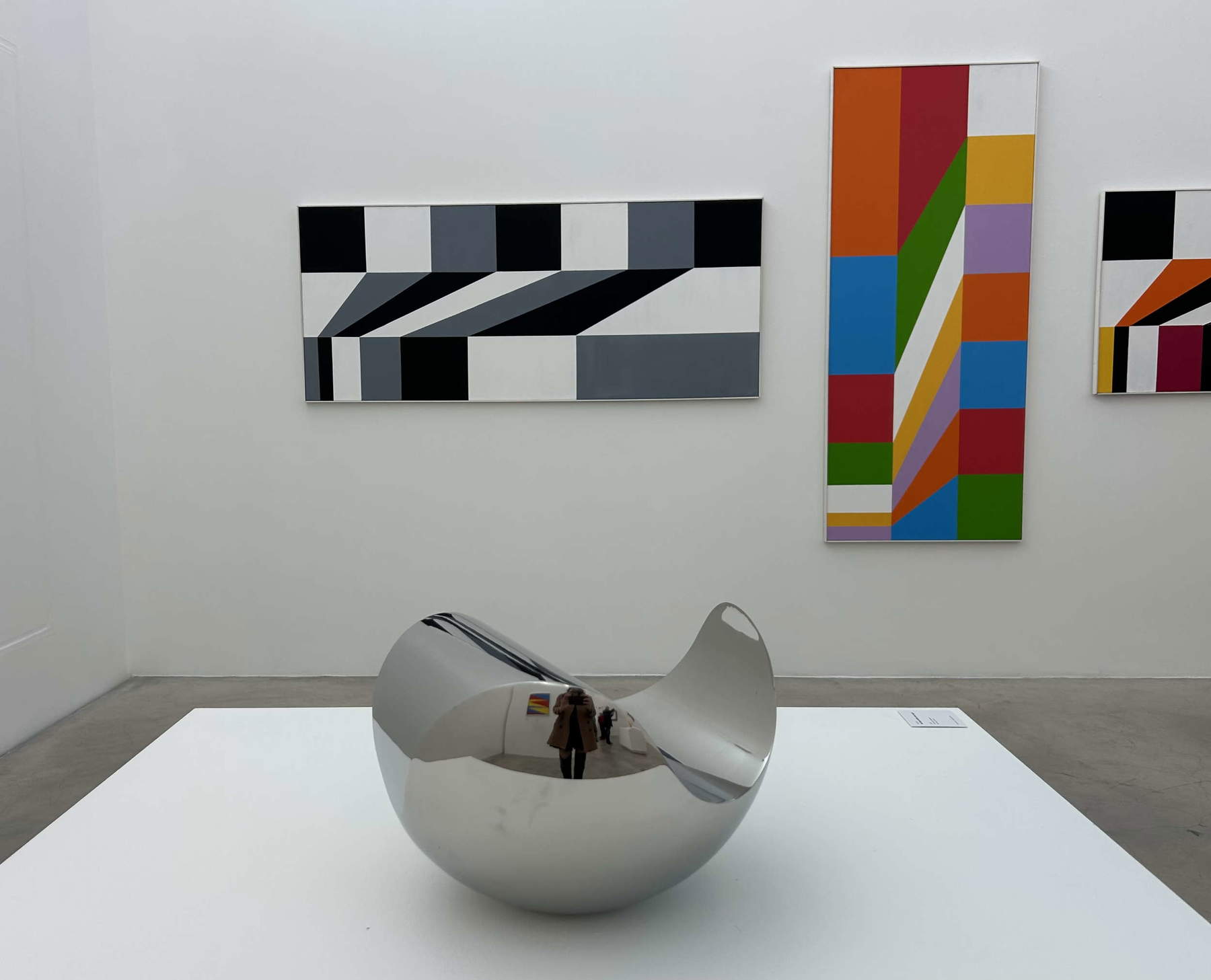
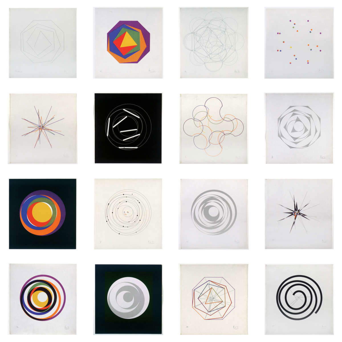
This is why the wall where today stands the work Quinze variations sur un même thème, dated 1938 and composed of sixteen lithographs in one hundred copies, is one of the most eloquent moments of his path. Sixteen sheets, arranged in a grid, show the same idea subjected to twists, openings, concentrations and dispersions. There are polygons revolving around a center, triangles inscribed in colored fields, orbits of thin lines, dots distributed like constellations, radial explosions, concentric circles, spirals, nuclei that seem to expand or contract according to an internal law. Bill seems to take a structure and force it to confess all its possibilities, one after another, with a discipline that possesses something of music and something of calculation, but without ever reducing itself to either music or calculation. The theme remains, yet it constantly changes; the form is recognized, but each sheet moves it just further, to a different zone of perception. It is a grammar, indeed, but a grammar in motion. Alongside these variations, the pictorial works allow us to correct another cliché. Bill is not only the builder of hard backgrounds and exact ratios. Some of the canvases on display, such as Betonung einer Spirale or Unbegrenzt und begrenzt from 1947, have a pulpy atmospheric quality, where color breathes and fades, creating soft fields, areas of shadow, color passages that seem to hold light before it becomes completed form. Here geometry recedes from its most rigid evidence and allows a visual sensibility of veiling and transitions to emerge. Form remains controlled, but color is not nailed down. It vibrates. It becomes dirty with air.
The sculptures, moreover, add an additional tension. The 1936 work, Konstruktion mit schwebendem Kubus, composed of gilded metal planes suspended within a slender structure, seems to hold movement in an unstable form, as if it were a fold of thought immortalized at the moment it decided to suddenly change direction. The planes cross each other and the void becomes part of the work.
This relationship between art and object, between work and function, finds one of its clearest formulations in design. Bill finds himself at the center of Milanese design culture in the 1950s, in an Italy in which industrial design is also developing through exchanges and contributions from across the border, with Switzerland in a privileged position due to geographical proximity and cultural affinity. At the 10th Triennale in 1954, this way of understanding form entered the field of industrial design with full force. Bill does not appear there as an artist lent to design, nor as a theorist called upon to give intellectual nobility to objects of use, but as a designer capable of holding together furniture, function, production and visual thought within the same formal problem. He exhibited several projects in the single furniture section, won the Gold Medal for the chair made by A.C. Möbelfabrik Horgen-Glarus and, in the same year, speaks at the First International Congress of Industrial Design with a paper with an almost elementary title, “What is Industrial Design,” which actually signals the decisive point of the question: design, for Bill, is not the minor art of the useful object, but the place where form is tested by function, material, production and everyday use.
And so it is that one of the last rooms of the Chiasso exhibition decides to translate this knot into an area of objects such as tables, stools, furniture, the blue clock/timer, and all those domestic forms arranged on candid platforms as if their simplicity finally demanded the same attention granted to a canvas. Ulm’s stool, with its essential light-colored wooden frame, appears almost primitive and sophisticated together: an object reduced to a few necessary relationships. The tables, with black tops and slender legs, seem more interested in clarity of function than in seducing the eye. In contrast, the blue timer introduces time within the discourse of form. Bill compresses its use, disciplines waiting, organizes the short duration of things. He designs a daily coexistence with time.
In 1956, a few months after an adventurous Milanese trip for a banquet in honor of Adriano Olivetti, Bill wins the La Rinascente Compasso d’Oro Award for the product aesthetics of a five-piece toilet set in transparent methacrylate made by Verbania srl of Cannero Riviera and distributed by Kristall of Milan. The jury rewarded the quality of the profiles, the enhancement of transparencies and the delicate plasticity, recognizing Bill’s ability to ennoble a then still misunderstood material through a barely perceptible correction of the usual forms. It is a wonderful passage precisely because of its apparent modesty: barely correcting. Not the obsessive need to invent by force or cover the object with a superfluous fantasy, but to bring it, rather, to its own evidence.
This same exactness runs through the graphics as well. The covers for Silone, the volume Tessiner Novellen by Aline Valangin, or the catalog of Abstract and Concrete Art itself, show a Bill capable of working on the page as on an architectural space.
The cover of Der Fascismus, with the title arranged on a black background, possesses a masonry severity; the 1947 catalog, with its large dark geometric element, transforms the page into a dynamic field; Tessiner Novellen interweaves photography, white circles and a red title according to a clarity that sets the volume not so much as a book per se, but as a true visual object. The relationship with Gillo Dorfles and the Movimento Arte Concreta (MAC) also confirms this ability to act as a junction. In the postwar period, the Libreria Salto became in Milan a gathering center for artists, architects and designers interested in the European avant-garde; Dorfles would recall precocious relations with Switzerland, trips to Lugano and Zurich to meet Bill, Lohse and others, while clarifying the need to handle with caution the idea of a direct kinship between MAC and Swiss Konkrete Kunst. Bill influences, connects, supports, writes, exhibits, but his relationship with Italy functions as a field of exchange, not an automatic transference. Milan, Zurich, Lugano, Comologno, the Triennale, “Domus,” the Libreria Salto, the Palazzo Reale, the MAC, Ulm, industrial design, reconstruction: everything contributes to building a figure who works within networks and makes the network a form of method.
And in the end, going through every single room of the exhibition, one understands that the grammar of beauty evoked by the title is nothing but a grammar because it allows the visible to articulate itself without dispersing; it is beauty because this order, when it works, produces experience, orients the body, educates the hand and modifies the gaze. Like when in a room the noise finally subsides and you notice the ticking that was already there. And notice, as if it were a new discovery, that little timer-clock, almost vulnerable, with that clear plastic and teardrop shape that has nothing of the object that wants to be looked at. It stands there, in all its understated shyness, and yet it seems to contain everything: the hand turning the knob, the somewhat silly and somewhat sacred waiting for minutes, the time that stops being a huge thing and goes back to being between your fingers. I have always thought there is something infinitely moving, after all, in the way Bill brings the form so close to ordinary life. He doesn’t protect it in the museum, he doesn’t let it become a monument, but he brings it into the small hours, into the unwitnessed gestures. And perhaps it is there that its beauty (a word we often use with too much emphasis and too little responsibility) becomes less impeccable and more true: when it no longer demands distance, and begins to resemble the time we lose, measure, and try every day, more or less clumsily, to hold together.


The author of this article: Francesca Anita Gigli
Francesca Anita Gigli, nata nel 1995, è giornalista e content creator. Collabora con Finestre sull’Arte dal 2022, realizzando articoli per l’edizione online e cartacea. È autrice e voce di Oltre la tela, podcast realizzato con Cubo Unipol, e di Intelligenza Reale, prodotto da Gli Ascoltabili. Dal 2021 porta avanti Likeitalians, progetto attraverso cui racconta l’arte sui social, collaborando con istituzioni e realtà culturali come Palazzo Martinengo, Silvana Editoriale e Ares Torino. Oltre all’attività online, organizza eventi culturali e laboratori didattici nelle scuole. Ha partecipato come speaker a talk divulgativi per enti pubblici, tra cui il Fermento Festival di Urgnano e più volte all’Università di Foggia. È docente di Social Media Marketing e linguaggi dell’arte contemporanea per la grafica.Warning: the translation into English of the original Italian article was created using automatic tools. We undertake to review all articles, but we do not guarantee the total absence of inaccuracies in the translation due to the program. You can find the original by clicking on the ITA button. If you find any mistake,please contact us.











 IT
IT FR
FR DE
DE ES
ES CN
CN