The Barcolana is one of the most prestigious sailing events in the world. Held every year since 1969 in the Gulf of Trieste on the second Sunday in October, it entered the Guinness Book of World Records in 2018 as the “Largest Sailing Race,” making it, thanks to the 2,689 boats entered, the largest sailing regatta on the planet. In addition to the sports competition, the Barcolana is also known for its artistic component, thanks to illycaffè, which has been the creative director of the event for ten years now. For each edition the company selects artists of the caliber of Michelangelo Pistoletto, Marina Abramović, Olimpia Zagnoli and many others. For the 56th edition in 2024, recognizing the affinity between the theme of this year’s event, “positive energies,” and his recent artistic work, the creation of the poster was entrusted to Stefan Sagmeister (Bregenz, 1962), one of the most important contemporary graphic designers, known for his eclectic, revolutionary and innovative style. We interviewed him for the occasion. The interview is edited by Monica Sperandio.

MS. Your artistic work since 2021, which began with the Beautiful Numbers exhibition and continued with the more recent Now Is Better project, focuses on a positive view of the world and society and from a practical point of view on the juxtaposition of ancient iconography with contemporary designed infographics. Can you explain the significance of this approach and how it connects and finds affinity with the poster created for the 56th edition of the Barcolana?
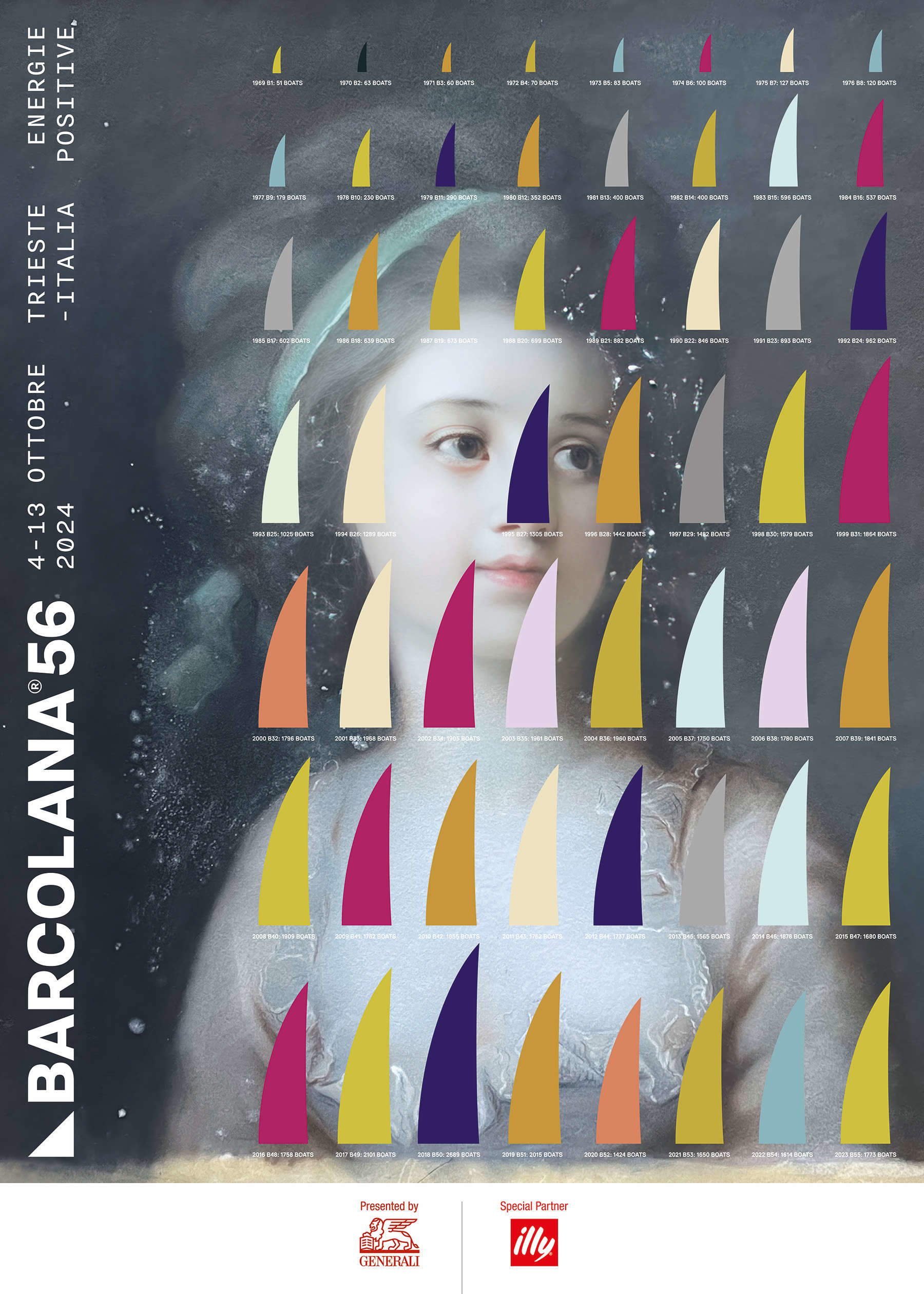
SS. For the past five years we have been working on a project about long-term thinking: media such as Twitter or hourly news created the impression of a world out of control, a democracy in danger and a general outlook of doom. But if we look at world developments from a long-term perspective (the only sensible way) almost all aspects of humanity seem to be improving: fewer people are going hungry, fewer people are dying in wars and natural disasters, more people are living in democracies, and they are living much longer than in the past. We created numerous visualizations with the goal that viewers would want to place them in their living rooms, to remind everyone that the latest tweets are just small signals in an overall pretty healthy environment. I thought I would also look at the Barcolana through this lens by visualizing data showing the incredible growth in the number of participating sailboats over the years.
The woman in the background, semi-covered by the infographic and thus seemingly placed in a secondary reading position, is instead the subject that at first glance stands out most in the viewer’s eyes, especially her magnetic and hopeful gaze. Where does this portrait come from? Who is this woman and why is she the protagonist of this poster?
We do not know the woman’s name, which remains mysterious, but I had bought this painting at auction because it had struck me precisely because of its magnetism. We also do not know for sure the identity of the author, but it is possible that it is Elisabeth Vigée-Lebrun.
It is clear that the concept of this edition of the event, “positive energies,” finds great affinity with your artistic work in recent years. What was the inspiration behind the poster design?
Considering that I have been working a lot on the concept of the long run, it seemed clear to me that I could look in the same way at the history of the Barcolana: an event that encapsulates a concept of positive progress that I find fully akin to my artistic idea. This approach made it possible to visualize and enhance data about its evolution over time.

Can you tell us where the initial idea came from, how it evolved, and what you want to communicate?
I started thinking about this theme when I was invited as designer-in-residence to the American Academy in Rome where I worked in a beautiful studio with artists, writers, architects and archaeologists. One evening I found myself next to a very sharp lawyer who worked at the European Court: we talked about politics and he told me that what was happening in Hungary, Poland and Turkey, but also in Brazil and the United States, was really the end of democracy. So after dinner I inquired! When was modern democracy born? How has it been over the last two centuries? Where are we now? In 1823 there was probably only one democracy, the United States. In 1923, after World War I, there were already 18 democratic countries. We now have, in 2024, 96 democratic countries, for the first time in human history more than half of the world’s population lives in a democracy, so he could not have been more wrong: not only are we not witnessing the end of democracy, but we are living in the absolute golden age of democracy. It was interesting to me: an intelligent, highly educated person who clearly has no idea about the world he lives in. That started my desire to look at the world in the long term.
Can you describe the creative process that went into the final realization of the project? What were the main challenges you faced?
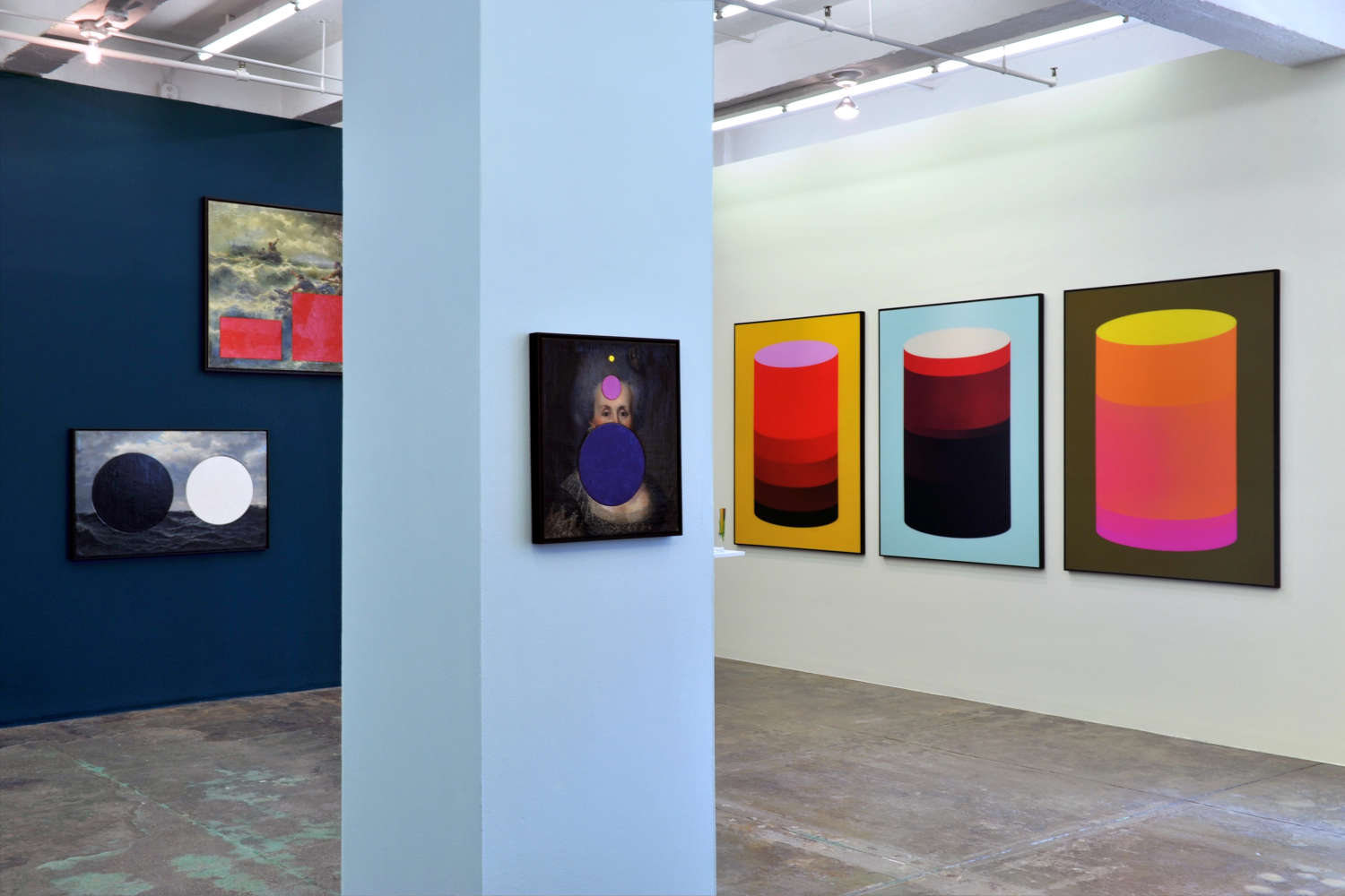
When it comes to long-term thinking, I have often found it interesting to work with historical paintings that had already been around for a long time before we started collecting data. For the Barcolana poster, I tried many different directions, including a stormy seascape. In the end we thought the mystery woman was a less obvious solution.
In your opinion, what role does the designer play in a cultural context like the Barcolana event? How can a designer contribute to the success and enhancement of such events?
Thanks to illycaffè, which has been in charge of the artistic direction of the Manifesto for years, I have tried to give an interpretation to this great sporting event and its values, celebrating it with the creative optimism that characterizes my artistic research and through the lens of Beautiful Numbers.
And more generally speaking, how can design influence society and culture?
Good design can help and delight people. Most people like to be helped and delighted.
Is there a philosophy or core principles/values that you always follow in designing your work?
I am an optimist. Optimism indicates rational thinking. If the final outcome of a situation can be exceptional or terrible (when the possibilities are exactly 50/50), then my prospects for success are clearly better if I approach it from a bright rather than a gloomy position. And if things are better today than they were in the past, the central topic of the Beautiful Numbers series, assuming that they will continue to improve in the future is common sense.

In an increasingly digitized society do you think the poster still retains its relevance? How do you see the role of the poster in contemporary visual communication?
I love the cultural poster as part of an urban landscape, i.e., the possibility of being informed about what is going on simply by walking around a city. As the placement of posters has become increasingly expensive, today this form of communication is increasingly replaced by billboards. But because a post on Instagram works very similarly to a billboard (it has to stand out in a crowded environment) many posters can achieve good results on social media.
In your professional journey, have you noticed an evolution in the way posters are perceived and used? If so, how has this changed over time?
Posters obviously only work in cities where people walk, so in New York City, where I live and work, you still see a lot of them around, but they have unfortunately been eliminated in most places in the United States where you drive around.
The creation of a poster, as in the case of event communication, inherently has a promotional purpose. However, in this case, the project also carries a concept, a message, and relates to a strand of thought shared by previous artistic works. What, in your opinion, is the relationship between art and design? And what is the dividing line between these two disciplines?
My favorite quote on the difference between art and design comes from Donald Judd: “Design must work, art must not.” According to him, art can just be, without being pulled by functionality. This poster, on the other hand, must also inform, so it must function.

The author of this article: Monica Sperandio
Classe 1998, si è laureata in Lingue e Letterature Straniere all'Università di Trento e successivamente ha conseguito un master in Social Media Marketing alla NAD di Verona. Da sempre appassionata d'arte, nel 2022 fonda The Sensitive Flower, progetto social di divulgazione artistica e culturale con lo scopo di diffondere bellezza e conoscenza. Attualmente lavora come libera professionista nel campo della comunicazione per il settore arte e cultura.Warning: the translation into English of the original Italian article was created using automatic tools. We undertake to review all articles, but we do not guarantee the total absence of inaccuracies in the translation due to the program. You can find the original by clicking on the ITA button. If you find any mistake,please contact us.