


From December 13, 2025 through March 28, 2026, the Galleria dello Scudo in Verona is hosting an exhibition devoted to a selection of works by Carla Accardi created between 1964 and 1965. The exhibition Carlaaccardi oroargento dipinti 1964 - 1965, in collaboration with theAccardi Sanfilippo Archive, brings together for the first time a nucleus of canvases characterized by the use of gold and silver pigments, which the artist used to explore the relationship between sign, light and pictorial space in a particularly intense phase of her creative journey. The large-scale works come from the artist’s collection and include works previously exhibited in Italy and abroad in the 1960s. The year 1964, in particular, marked Accardi’s invitation to the XXXII Venice Biennale with a solo room, a moment documented by some of the canvases on display today. In a text in the catalog, Carla Lonzi observes how Accardi crosses over into informal without fully identifying with it, yet perceiving its presence as a pre-existing element.
The use of gold and silver pigments marks a change in the artist’s practice, which shifts painting to a new dimension of luminosity. The surfaces of the canvases converse with the external space, exploiting the reflective properties of metals and creating visual effects that change depending on the point of observation and the angle of incidence of light. In works such as Grigio scuro oro (1964), Argento oro 1 (1964) and Argento oro 2 (1964), the arrangement of the sign, diagonal bands, horizontal stripes, lozenges and parallelepipeds, recalls the structures of the paintings presented in the same year at the Venice Biennale, including Homage to President Kennedy and Oriente.
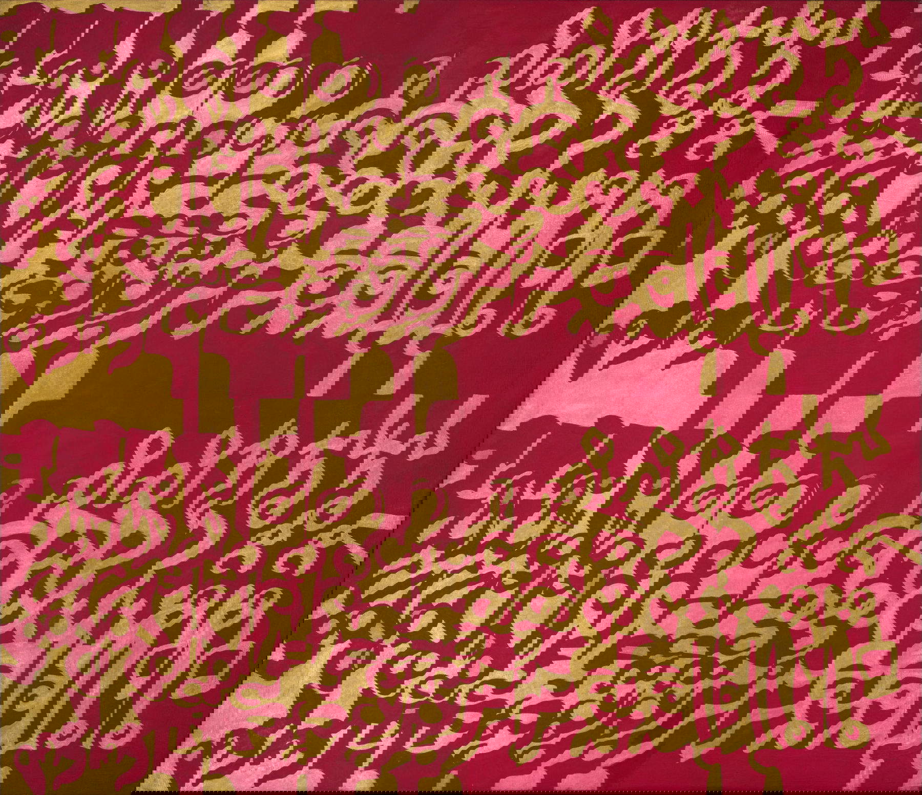
The following year, works such as Ororosso (Oriente No. 1), Oroblu (Oriente No. 2) and Scacchiera oroverde show an evolution in the handling of the sign: forms become more regular and sequential, while paint and background acquire equal roles in the construction of the image. In this period, Accardi continues an investigation begun in the mid-1950s with the black-and-white works, where the tension between figure and background defines space, and in later years in the fluorescent and complementary color works, in which light and the viewer’s optical perception become central elements.
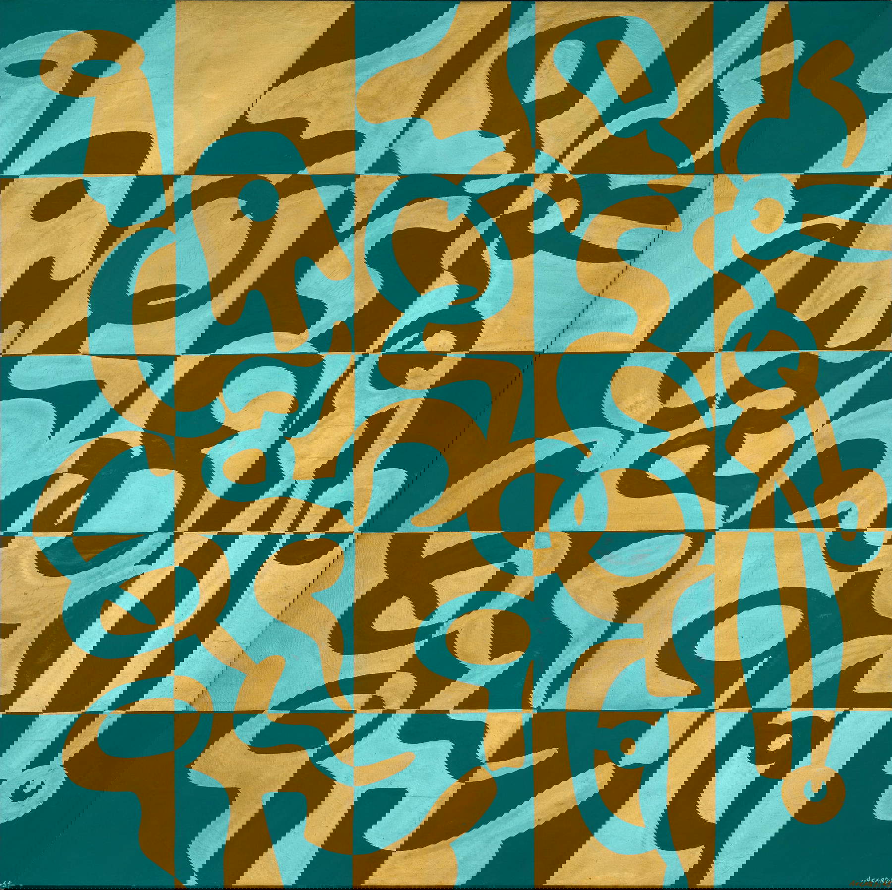
Scacchiera oroverde (1965), presented at Galerie Stadler in Paris, is commented on by Umbro Apollonio and Michel Tapié as an example of Accardi’s ability to organize the sign into groups and bands that, while defined, generate a pulsating vitalism extended to the entire surface. The works of these years demonstrate how gold and silver become vehicles of light that interact with the surrounding space, creating images that act by reverberation and openness. Critics and art historians have observed the particular quality of these works. Gillo Dorfles, as early as 1964, highlighted the “brilliance” effects of fluorescent and silver colors, capable of producing admirable chromatic accents. In 1976, Anne Marie Sauzeau Boetti noted the pulsional and antinatural aspect of the two-tone employed by Accardi, obtained through technological or metallic pigments. The artist herself, in an interview in Flash Art in 1989, recalls how the use of fluorescent and transparent color was a choice aimed at intensifying light, matured after a visit to the Mausoleum of Galla Placidia in Ravenna and participation in the Venice Biennale.
Further interpretive perspectives emerge from the 1989 anthological exhibition at the Galleria Civica di Modena, where Marianne Brouwer notes how Accardi’s works recall ancient traditions of light, from Persian mosaics to the domes of Arab mosques, suggesting a philosophical dimension of light perception. The Verona exhibition also includes a selection of works on paper, made with gold and silver pigments on colored supports. The works, never presented in public in their entirety, constitute a cohesive nucleus in which the sign moves freely in circular sequences or dilated to the edges of the sheet. Germano Celant, in 1999, defined these surfaces as characterized by a dance of reflections, where colors and materials float and interact with the surrounding environment, generating continuous luminous reverberations. To accompany the exhibition, Galleria dello Scudo is publishing a bilingual catalog with texts by Bruno Corà, Paola Bonani and Daniela Lancioni, accompanied by a rich iconographic apparatus.
 |
| Carla Accardi in Verona: gold and silver paintings from 1964-1965 on display |
Warning: the translation into English of the original Italian article was created using automatic tools. We undertake to review all articles, but we do not guarantee the total absence of inaccuracies in the translation due to the program. You can find the original by clicking on the ITA button. If you find any mistake,please contact us.


