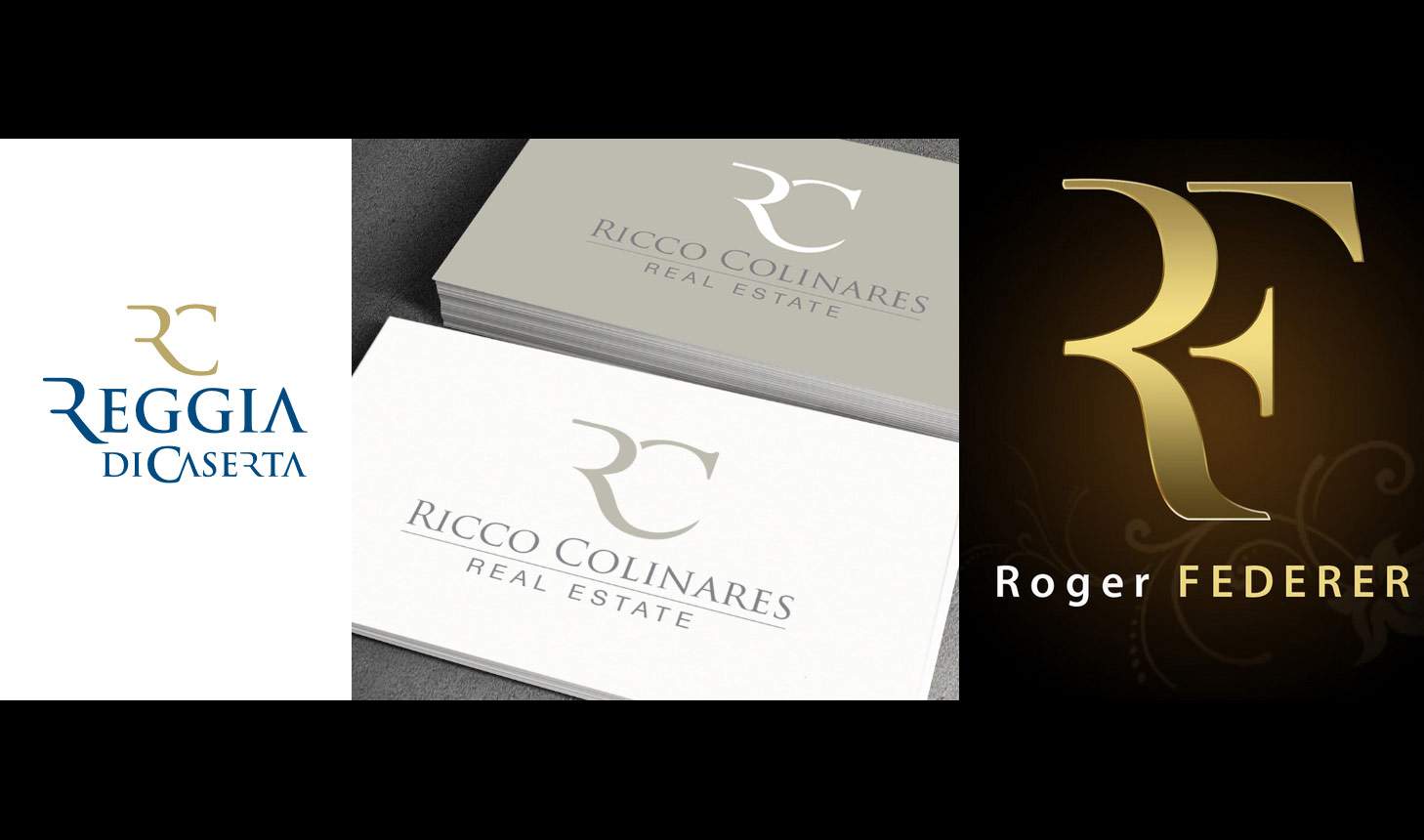
The new logo for the Royal Palace of Caserta, announced with pomp and circumstance last April 22, has lasted like a cat on the Aurelia: the creative that was supposed to define the new identity of the Bourbon palace, subjected to almost unanimous criticism, has in fact been withdrawn. The logo, created by Sigla Comunicazione, an agency in the province of Mantua, with direct awarding on the basis of the best offer (which in this case was 37,500 euros), was accused of being unoriginal and similar to the logos of other companies: the Caserta Order of Architects even saw similarities with the logo of tennis player Roger Federer (which consists of a stylized R and F). But that’s not all: scouring the web, a logo was found on the DesignCrowd platform virtually identical to that of the Reggia, created by a Japanese user (such a “zimple”) for a Canadian real estate agency, Ricco Colinares: the Japanese designer, in 2014, participated in a contest on the platform (users looking for a logo, in fact, can submit the idea and receive proposals from designers registered with DesignCrowd), and his proposal turned out to be the winning one, chosen by Ricco Colinares on September 24, 2014. And paid $69.
There have also come accusations of a lack of historical-artistic and territorial references and a failure to involve specialized local agencies since, as mentioned, it was a company from Mantua that made it. Among the harshest were the aforementioned Caserta Order of Architects, which issued a harsh statement, just two days after the logo’s presentation, to soundly reject the choice and to point out how the logo seems “to have been borrowed from that of the famous tennis champion Roger Federer” or that of the aforementioned platform. “The brand that should represent a monumental complex such as the Royal Palace of Caserta, a UNESCO heritage site,” the architects write, “cannot be thought of as a logo of a private individual or a simple company, it should instead encapsulate historical-artistic but also territorial references. In this logo, there is no stylistic reference to either the palace or the spectacular Vanvitellian park, the choice seems totally unrelated to the magnificence of the Reggia.” Heavy was also the comment of Enrico Bonetti, professor of marketing at the Faculty of Economics at the University of Campania, who said in an interview with Il Mattino, “it seems to lack elements of originality and personality to be able to represent a place that, instead, has a very strong identity. It is not a good start: in fact, in this case, there is a strong point (the Reggia itself) that is not used, so there is the risk of having more difficulty in getting that sign recognized and remembered.”
In a statement issued on April 22, the same day the logo was presented, the Reggia had motivated the new logo in these terms: “the initials of Reggia and Caserta, King Charles, Real Casa, ’R’ and ’C’, have become that symbol, the starting point of a path that looks to the future to give the right recognizability, also international, to the Institute. The new logotype was created with a typeface faithful to the Vanvitellian stylistic features, with a current, contemporary and durable transcription. The primary colors are those of the Bourbon coat of arms: blue, for the institutional voice; gold, for the suggestion of the museum itinerary.” And even the Reggia’s promotion and communication officer, Valerio Di Fratta, said that “the key word of this creative project is inspiration. It was not easy to find a sign that encapsulates the multiple identities of this monumental complex. We carried out an analysis of the current visual identity, international positioning, brand effectiveness, quality of communication tools, clarity and correctness of information to visitors.”
Evidently, however, this analysis of brand positioning and effectiveness did not go through the use of Google Images to find out if something similar already existed. So, after heavy criticism, came the about-face: with a note that reiterated the choices that led the management to evaluate as necessary the creation of a new museum narrative, the press office of the Royal Palace of Caserta speaks of “exploitation of the last few days,” but makes it known that in light of what has emerged “and only because of the similarity of the monogram to others that already exist, in order to protect the institution,” the museum has decided that the visual identity of the museum will be connoted only with the brand “Reggia di Caserta” without the monogram. From now on, therefore, away with the “RC” logo: in institutional communications we will read only “Reggia di Caserta.” But the museum also makes it known that “as already stipulated in the contract signed on December 23, 2019, an international logo competition will be launched below. The competition will be aimed at creating a sign that should reflect the visual identity of the Royal Palace of Caserta.”
Perhaps it is not the internationality that matters, however: an Italian or Campania-based agency would also be fine, just avoid making a bad impression by checking that a logo is not identical to other existing proposals.
Pictured below: the logo of the Royal Palace of Caserta, that of Canadian real estate, and that of Roger Federer.
 |
| Royal Palace of Caserta, what a figure! Withdrawn controversial 37-thousand-euro logo, call for bids to remake it kicks off |
Warning: the translation into English of the original Italian article was created using automatic tools. We undertake to review all articles, but we do not guarantee the total absence of inaccuracies in the translation due to the program. You can find the original by clicking on the ITA button. If you find any mistake,please contact us.