As a technician, since my job is that of web designer and web developer, before that of popularizer, I have been asked to comment on the new project of the Ministry of Cultural Heritage, verybello.it, the site that was launched in the last few hours (but perhaps they would have done better to throw it out the window) and that is supposed to promote the cultural events organized in view of Expo 2015. On the content aspect and the image of the site I think everything has already been said: a name was chosen that traces the slang of the trendiest discos in Forte dei Marmi, and that sounds good in the mouth of the 20-year-old Russian woman swaddled in a leopard-print top and picked up by SUV by the marble industrialist, but certainly not associated with the MiBACT logo. Not to mention yet another use of the rhetoric of beauty: by now we are tired of even saying that we are tired of “the great beauty of Italy” style phrases. And that’s leaving aside the fact that the first event we find under the slogan “Travel in beauty” is an exhibition on World War I (I don’t know about you, gentle readers, and especially gentle ministry officials, but an exhibition on World War I doesn’t exactly fully reflect my concept of “beauty”).
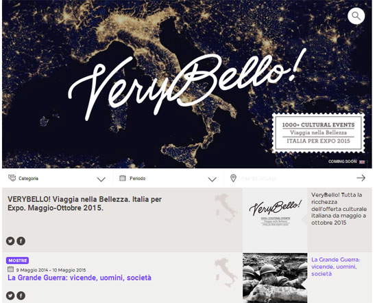
So let us focus on the purely technical side. And let’s start with the first aspect: the slowness of the main page, the home page. A page that weighs 3.3 Megabytes: an enormity, if we think that the website is responsive, that is, it adapts to the size of the user’s device (so there is no special mobile version), and a user who downloads the home page with perhaps a slow connection will probably abandon his plans after a few seconds. Because, of course, the weight of the page affects the loading time. To have a term of comparison: the home page of the site you are reading, Finestre Sull’Arte, has a weight of 680 kilobytes (about one-fifth, dropping to 430 on the mobile version).
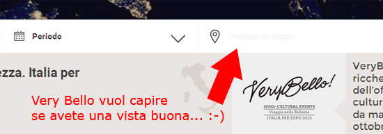
But what about the search form? I defy anyone, even those with excellent eyesight, to figure out on the fly that next to the Google Maps marker logo there is a line that says “enter a location.” You can see it if you look at the monitor against the light (although I don’t think that’s the way it’s supposed to read on a screen), because whoever programmed it thoughtfully used a very light gray (hexadecimal #eaeaea, i.e., almost close to white) script on a totally white background.
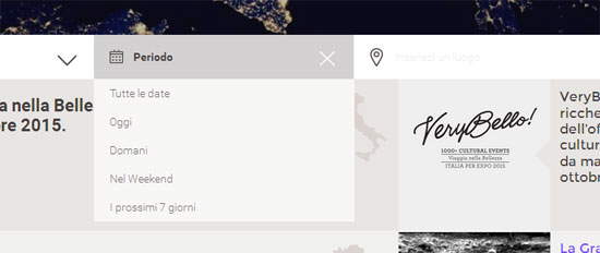
Oh right, the search engine: the programmers will later explain to us for what absurd reason they set the page refresh (i.e., refreshing) every time an option is chosen from the search engine drop-down menus. Most importantly: in the date selection menu, was it so difficult to include a calendar to allow the user to choose the desired dates, instead of setting it to “today,” “tomorrow,” “on the weekend,” “in the next 7 days”? Because it is obvious: a tourist arriving from Singapore or New Zealand or Patagonia to visit the Milan Expo will decide to do so just a week before arriving. A tourist who, moreover, will find a site that is now available only in Italian very useful, so much for the international dimension of the Expo, and so much for the fact that the site was designed primarily for a foreign audience.
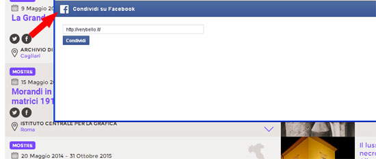
And what about the social sharing buttons that appear below event titles? Leaving aside the fact that only two have been included, if we click on the Facebook one we can see that it does not work since, whatever event we want to share, the Facebook sharer brings up the URL of Very Bello and not that of the individual event (and of course the event description is also missing).
Shall we move on? Well, try reaching the footer (i.e., the footer). It will escape you every time you try, since the programmers have built in an automatic loading of content at the scroll of the page, i.e., when you scroll down the page, and so every time you approach the footer new content is loaded (and the footer escapes). And again: there is a huge header (that kind of megapattern with the picture of Italy as seen from the satellite) that is nowhere clickable: it would have helped the usability of the site to make the logo clickable and send the user back to the home. Because it actually looks like the site consists of a single page, but in fact there are also pages dedicated to individual events (like this one: http://verybello.it/e/40). The problem is that there are no links on the site to enter the individual event pages...or at least, I couldn’t find any, I only found out about the existence of such pages thanks to the Twitter sharer.
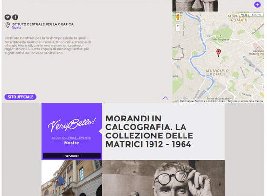
But we still insist onusability. The site, for each event, provides as many as two buttons to expand the preview: one loads a mini description of the event along with a map where the venue is located, and the other loads the exact same description, only with a larger photo. But why? What’s the point? Couldn’t it have saved the user a click and put everything under one button? And let’s not even talk about the minimal improvements that could have been made: for example, making city names clickable in order to allow users to find all the events for a given city, or even making sense of that “www.verybello.com” with attached arrow that appears next to the mini-description (but what purpose does it serve?).
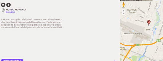
And again, some of the maps are completely out of whack! Take the box devoted to the exhibition Morandi and the Ancient: Vitale da Bologna, Barocci, Rembrandt and Crespi: it is the first one we noticed among those we have already visited, so it was also the first one we opened. Well, the location of the Morandi Museum (where the exhibition is being held) indicated on the map is several kilometers away from the actual location of the museum: if the famous Singaporean tourist mentioned above followed what verybello.it indicates to him, he would find himself wandering aimlessly in Borgo Panigale, in the vicinity of the Bologna airport, instead of in the center of the city.
But do we really want to hurt ourselves and check theaccessibility of the product? If you try to disable JavaScript, the site becomes virtually useless since the search engine does not work (no small detail, since it is the main functionality of the website) and the number of events that can be displayed is limited since, without JavaScript, the automatic loading of the above content also fails. Moreover, for institutional sites, accessibility is a legal requirement.
In short, any comment on this bad product probably seems superfluous. One can only wonder what was the point of spending money on it, and from the Ministry we hope they can as soon as possible let us know how much this site cost us, which they might as well have spared us. Obviously trivial consideration but, believe me, on seeing this site, and the emphasis with which it has been promoted by Minister Dario Franceschini, I was very taken aback. Speechless. I would rather let the Twitter users be the ones to speak up for what I think. Take a look at what they have to say.

The author of this article: Federico Giannini
Nato a Massa nel 1986, si è laureato nel 2010 in Informatica Umanistica all’Università di Pisa. Nel 2009 ha iniziato a lavorare nel settore della comunicazione su web, con particolare riferimento alla comunicazione per i beni culturali. Nel 2017 ha fondato con Ilaria Baratta la rivista Finestre sull’Arte. Dalla fondazione è direttore responsabile della rivista. Nel 2025 ha scritto il libro Vero, Falso, Fake. Credenze, errori e falsità nel mondo dell'arte (Giunti editore). Collabora e ha collaborato con diverse riviste, tra cui Art e Dossier e Left, e per la televisione è stato autore del documentario Le mani dell’arte (Rai 5) ed è stato tra i presentatori del programma Dorian – L’arte non invecchia (Rai 5). Al suo attivo anche docenze in materia di giornalismo culturale all'Università di Genova e all'Ordine dei Giornalisti, inoltre partecipa regolarmente come relatore e moderatore su temi di arte e cultura a numerosi convegni (tra gli altri: Lu.Bec. Lucca Beni Culturali, Ro.Me Exhibition, Con-Vivere Festival, TTG Travel Experience).
Warning: the translation into English of the original Italian article was created using automatic tools. We undertake to review all articles, but we do not guarantee the total absence of inaccuracies in the translation due to the program. You can find the original by clicking on the ITA button. If you find any mistake,please contact us.