We are only a few months away from the start of the Milan Cortina 2026 Olympic and Paralympic Winter Games, but the Olympics and Paralympics to be held in Italy, exactly 20 years after Turin 2006, already have their own well-defined identity that is made up of art, design, culture and that is expressed through a look that passes through the flashlight, medals, posters, pictograms and much more. The idea is to offer everyone-athletes, spectators and, in general, everyone who looks to Italy during these stages of preparation, and even more so during the competitions-a precise narrative. We were told about this intersection of art, design and sport by Raffaella Paniè, who serves as Brand, Identity and Look of the Games manager for Milano Cortina 2026. The interview is by Federico Giannini.

FG. The visual project of Milan Cortina 2026 seems to want to go beyond sports communication and enter more artistic and cultural territory. How did you work to give the Games an identity that also speaks the language of design and contemporary art?
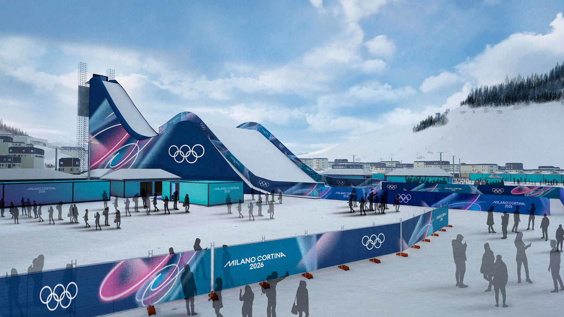
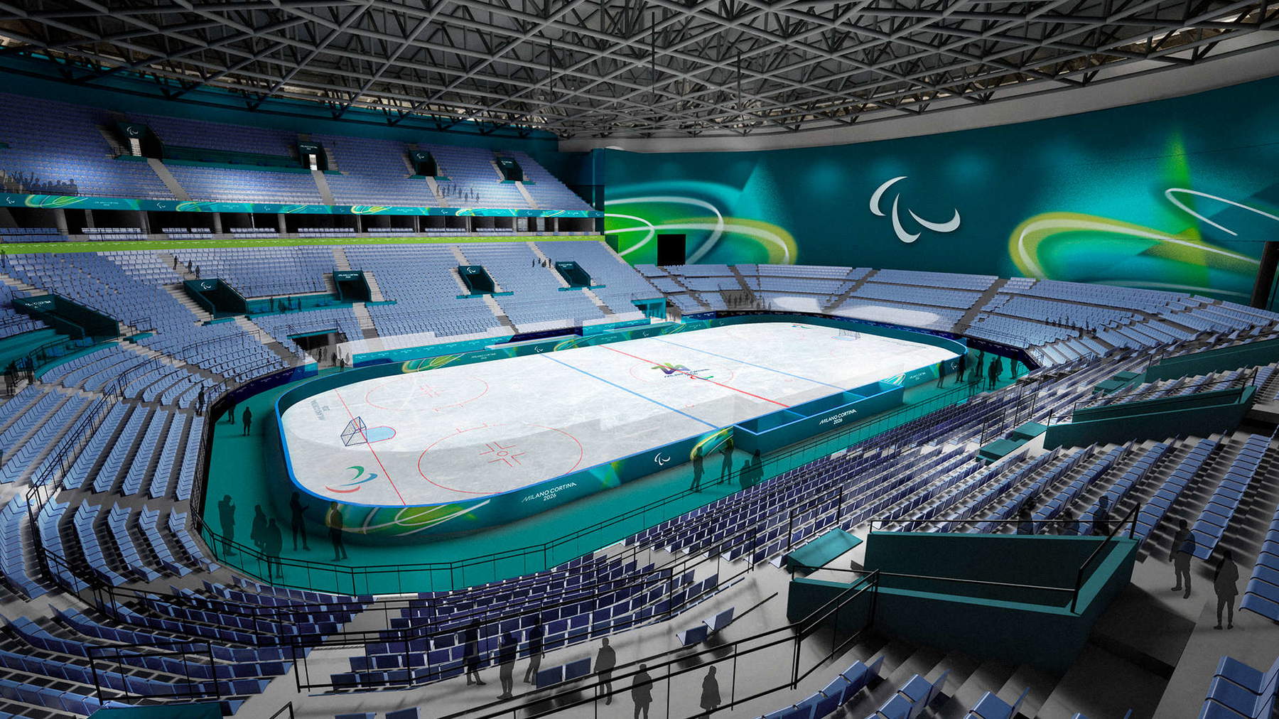
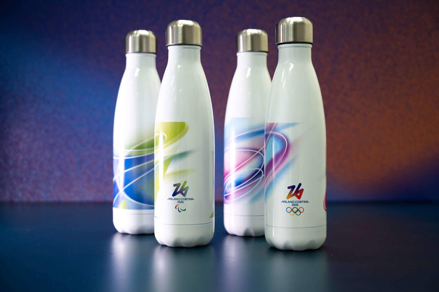
RP. Perhaps the premise to this question is the fact that the Olympic and Paralympic Games is really a special project. You build in four years a brand that, when it reaches its climax, stops existing the next day. This is also unique to us working on it. The process always starts with identifying a brand personality. It is clear that any organizing committee is born under the umbrella of the International Olympic and Paralympic Games, however, it then builds its own identity based on nation, culture and also specific positioning that can go in very different directions. The Paris 2024 edition, for example, focused a lot on the territory and Paris city, so less on France in general, but a lot on the capital in its specificities. The work that we did, and that goes back now three and a half years, was precisely to say, “what do we want to tell about these Games?” Since Italy obviously has its own very broad positioning as a territory and as a tourist destination, the concept of territorial beauty emerged a lot in the research work we did, but we did not want to tell it following the traditional stereotype. So we chose to tell not so much about the beauty of the territory, but to talk precisely about deep cultural beauty and the beauty of people. This decision took us more and more in the direction of a story about people, humanity and those who represent and tell about our territory and the edition of our Games. This was the beginning. Then on that we built building blocks. For example, the work we did on the font was very specific: we created a specially designed “Milano Cortina” font, a script font that goes in the direction of adding warmth and personality to the brand identity. The most important piece in this journey was the launch of the Look of the Games that we did last year, which is really the visual identity. It is the transition from brand positioning work to a hands-on approach, the transformation of everything into visual identity. The Look of the Games has a very strong cultural inspiration: from a graphic point of view it goes back to the avant-garde, there are references to futurism, and it has a language that is perhaps the most specific aspect of our edition, even looking at what has been done in the past, because we have created, with the support of an agency, this system of “vibes” that are potentially infinite for us (instead of creating a kind of basic framework from which we then cut out pieces to create the brand identity, we have a system of “vibes” that obviously has value references to our brand personality and that could be developed endlessly). At some point we also had to give ourselves a limit, because the risk was to have a very complex visual identity. It is definitely a very interesting system, though. We are also developing it for the partners who are following us, and I think we will mark an important milestone on this point for the International Committee as well.
In a context like the Olympic Games that all of us on the outside imagine is often dominated by institutional and rigid codes, what kind of freedom of expression have you allowed yourself in building the “Look of the Games”?
The freedom is total. Sometimes, at the beginning of the process (and I think it applies to other committees as well) there is, however, a bit of blank sheet anxiety. Certainly brand personality serves and is an indispensable starting point because it guides you, but it is clear that it could go in so many directions. We chose, for example, to want to tell the beauty of Italian talent, the gesture of talent. We liked this path very much when they proposed it to us, however, it took a long time to get into gear, to understand if it was a potentially correct path, and also to solve a whole series of technical issues, because the “vibes” are a very complex graphic element even from a technical point of view. The initial study was done with an agency, but then now, however, the implementation, the development, and also the new “vibes” that we are studying for partners are born internally, and are managed by our internal team. It is definitely work that, now that we have finally solved so many issues, I find very interesting.
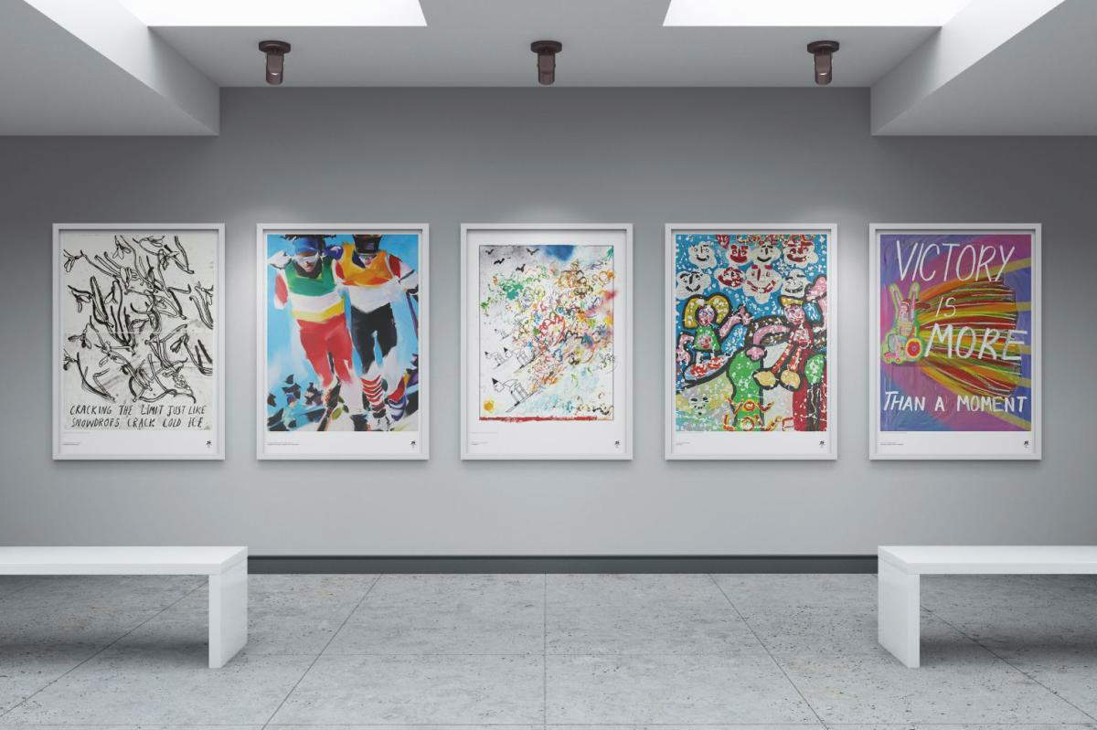
By the way, since you mentioned talent. Among the talent you have involved are artists under 40 to whom you have entrusted the official art posters, also giving a curatorial edge to the project. What is the vision behind this choice? What did you want to tell through the looks of these young artists?
The art poster project is one that we intentionally did together with people who have that credibility and expertise. The curatorial aspect is very delicate and it’s an aspect where, even on an international level, you have to have credibility, so on this we found an exceptional partner (also from a human point of view) in the Milan Triennale, with whom we did an initial brainstorming just on the cut we wanted to give to the project. We started obviously with the brand, so we told who Milano Cortina is, what it wants to tell, what graphic assets we developed, knowing that they could serve more as inspiration, because the art poster cannot be a graphic work. It has to be rightly given a lot of freedom to artists in interpretation as well. And it was the Triennial itself that made this proposal to us of wanting to focus on young people. By the way, we have another project on which we will make announcements later in the fall: the official poster. In fact, each edition of the Games has a single poster that is identified as the poster of the edition: we are also working on this project with the Triennale and, also to differentiate the approach, we have chosen, for the art posters, to work on painting. The indication that the Triennale proposed to us was this: to work with young people who worked with painting, who had already worked with the Triennale, who had already done an exhibition at the Triennale for another project. We then selected them together, of course, because the number they had involved in their project was much larger, so we went and made a selection of ten artists together with them, a selection that would go in this direction.
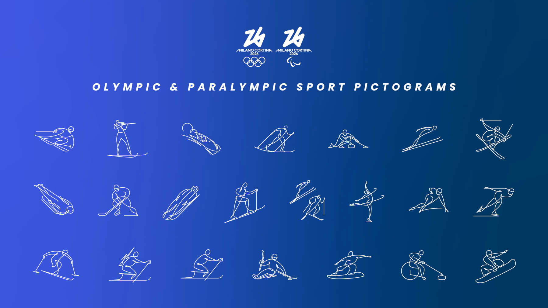
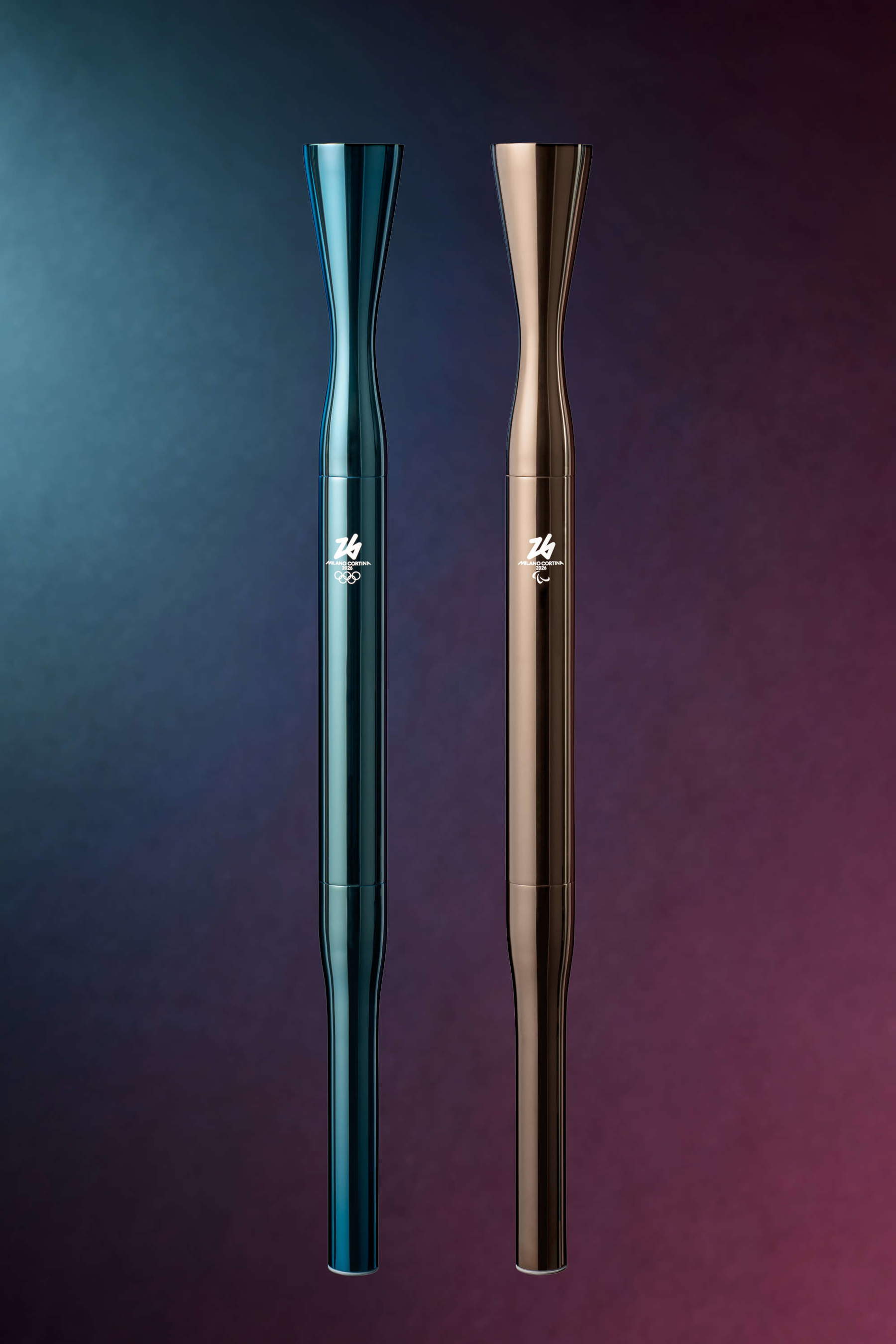
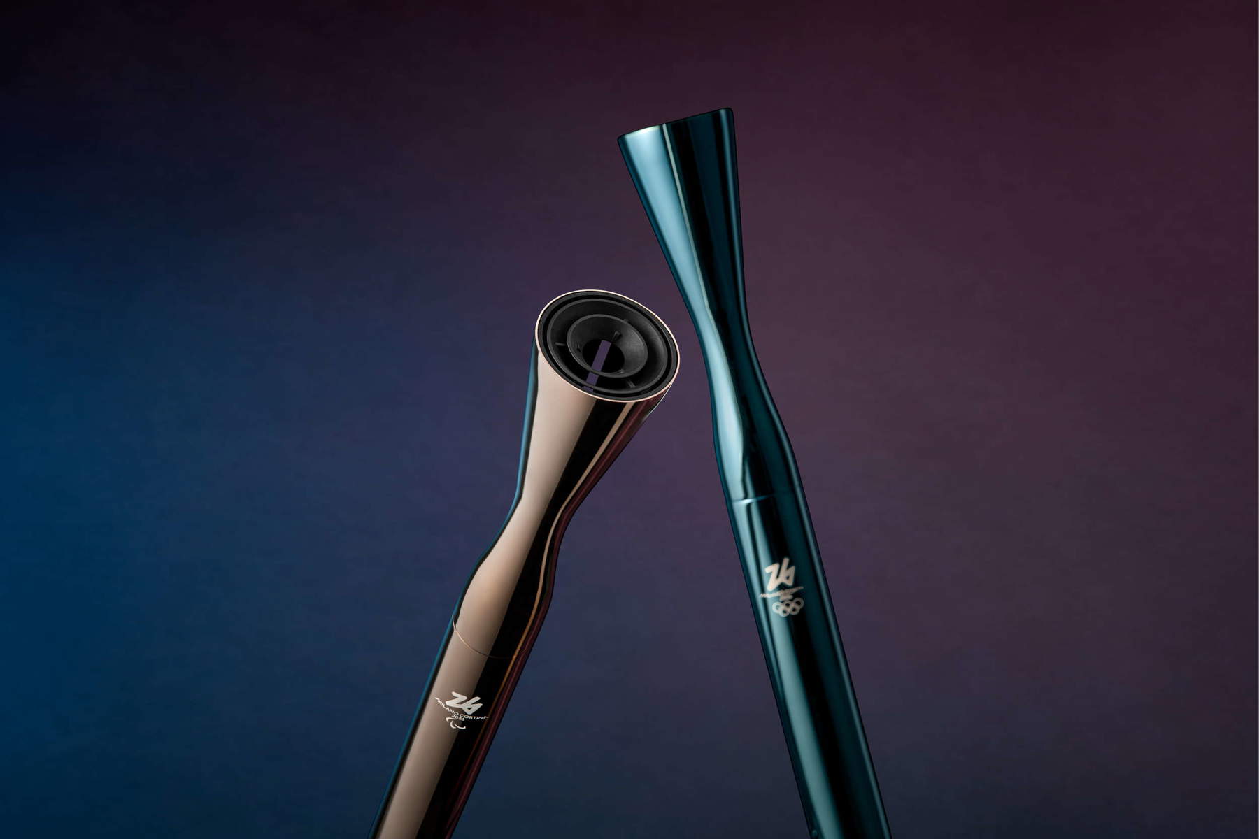
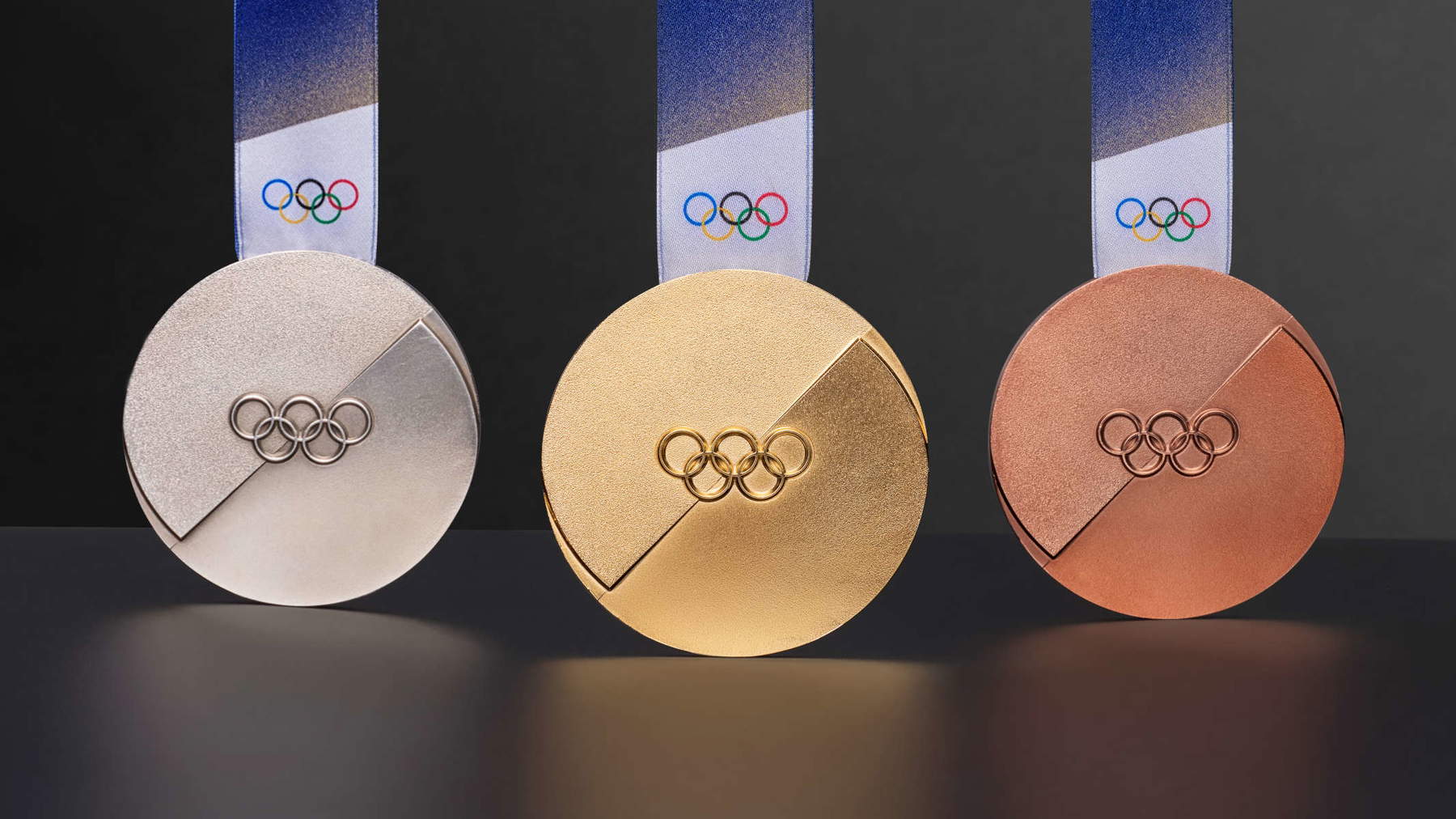
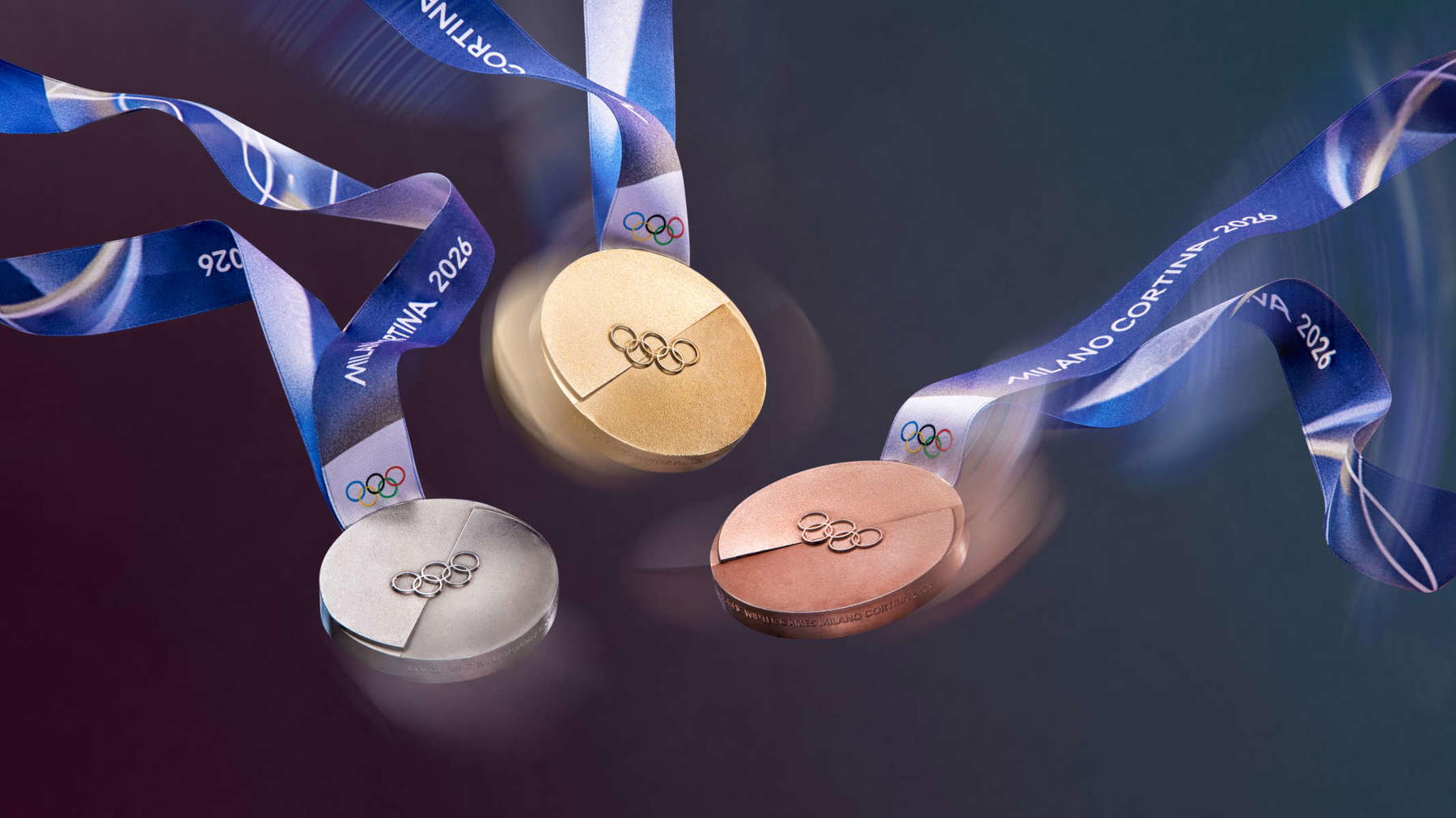
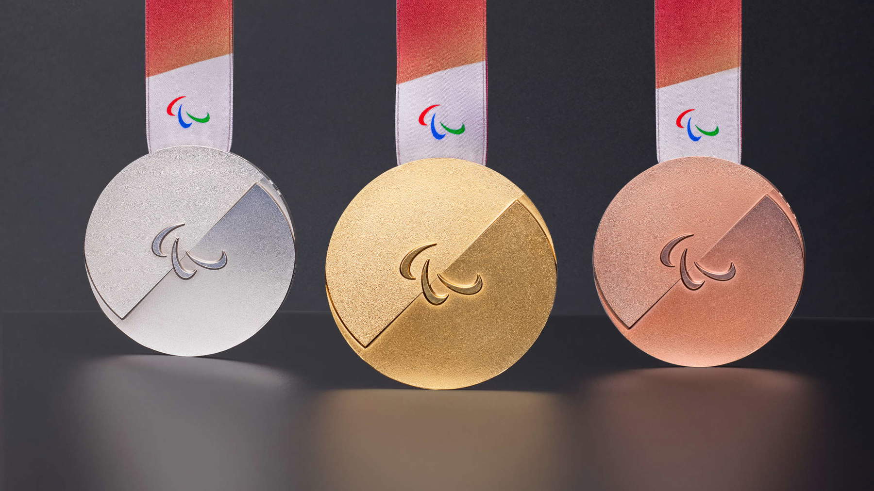
Let’s talk instead about the symbols of the Games. The Olympic flashlight, designed by Carlo Ratti, has an almost sculptural force. The broken and reassembled medals, with the two souls Milan and Cortina meeting, are an interesting example of narrative design. How do objects such as flashlights, medals and pictographs become-in your approach-works of design and not just functional tools? How important is it today that design tells stories, as well as being functional for a certain purpose?
The important thing, in our opinion, is that it represents us. I have to say that at the beginning of the process, in the Look of the Games in particular, but then also on flashlights and medals, we felt a lot of international pressure on us, because there is an expectation from everybody about Italy very, very high. It was important for us not to overdo it. The look is a design that obviously tells about celebration, so it was necessary to keep an impression, on the one hand, of design, of elegance that I think we managed to convey, and on the other hand of celebration and color. Flashlight and medals, however, remain deliberately essential objects because we believe that in essentiality you can represent without the need to add many graphic elements and you can tell very well an edition that is Milan Cortina first of all, but then it is all Italy.
In your presentation of the medals last week, you focused a lot on the fact that these objects will be made by adopting environmental sustainability criteria. “Sustainability” is a word that is often overused, but in your case it seems to be consistently declined in the language of design. How do you combine ethical values and aesthetic choices in your work?
From a production point of view, any project has a sustainability annex. We have an internal function that deals with sustainability, which is very demanding, and it also dictates our timing on this issue, precisely because those in that profession know that it takes very little to put a sustainability stamp on it and in some way clear their conscience. It is clear that everything we do has to be certified, especially in the origin: we have a sustainability control process that starts right from the origin, so where the materials come from. Then it is clear that when it comes to the medal or the flashlights, it is not so important that they are recyclable, but that the materials from which the object is made come from sustainable sources and above all certifiable. This is work that we do all the time and with the support of experienced people to guide us, so that we can declare that actually what we do is certifiable. Now, for example, on the flashlight we are in the process of officially certifying the sustainability process. We have done the prototypes for now, but from the production side we are trying to follow the same process, so to have an official certification that is not our word and stamp, but a guarantee of what we have declared.
Speaking of guarantees, a question between the serious and the facetious: can we guarantee to the athletes who will make it to the podium that what happened last year in Paris with the medals deteriorating will not happen to them?
I characteristically tend not to guarantee things that I have not yet experienced. But I can tell you that during the first meeting we had with the State Polygraph (a contract was not yet signed, there was not yet a sponsorship agreement and there was not yet a design) the first thing we put on the table was just that. It is clear that coming after Paris we have the lessons of what happened. We studied this in depth both with the International Committee and with the Polygraph, which has very experienced people and helped us understand what happened. There have been editions in the past where some medals were ruined, but Paris undoubtedly had a particular problem, due, from what we understand, to the substances they used and changed in the run-up, but because of a European law regulation that had changed at the last minute. I wouldn’t blame them for that, but they certainly had to deal with a number of issues that we are not dealing with for now. The Polygraph has to give us certification and they have to do (and are already doing) a whole series of tests. The choice of design that we made and some aspects where we took one direction and not another were also guided by suggestions from the Polygraph, which would certainly have ensured better quality, because the medals, once they are produced and engraved, are treated with an antioxidant agent that creates a protective film. So the design is studied so that the film is put on at the end of the whole process and once it is put on it has no external elements. For example, the outer buttonhole: we also worked on inserting the ribbon inside the medal without the need for outer buttonholes. And then obviously such a clean medal works better if it has no external elements: we tried to avoid anything that could have any influence. Remember that the Paris medals were made of two elements, two materials, one of which was of ferrous origin (the iron of the Eiffel Tower), with hooks holding the hexagon of the ferrous part attached. From a chemical point of view, that reagent solution certainly did not help them, combined probably also with some problematic agent they used as an antioxidant. To us all of this is now crystal clear. And the Polygraph has a very high history and expertise, so I’m pretty sure that a problem like the one in Paris we will not face.
To conclude: what do you hope will remain, visually and emotionally, in the collective memory after the Games are over?
This is a recurring thought that we have. For example, when we saw the medals in their final phase, we said “let’s try to close our eyes and imagine them 20 years from now,” but we also built our motto “It’s your vibe” on this concept. We really liked the idea, rather than being a slogan where we tell the public “who we are” in a one-sided way, to go back to the people, the human aspect of the Games. What I think it would be nice to be reminded of the people of these Games is kind of the whole “vibes” of everyone, and that everyone comes to the Games with their experience, their perceived experience. We bring another one, with our whole sports project, branding, communication, our mascots: we will tell a piece of the Games, but then people will of course combine it with their own perception. I hope everyone will go home with their own vibe, certainly each one different from the other, but positive, really telling a 360-degree story of our edition of the Games.
The author of this article: Federico Giannini
Nato a Massa nel 1986, si è laureato nel 2010 in Informatica Umanistica all’Università di Pisa. Nel 2009 ha iniziato a lavorare nel settore della comunicazione su web, con particolare riferimento alla comunicazione per i beni culturali. Nel 2017 ha fondato con Ilaria Baratta la rivista Finestre sull’Arte. Dalla fondazione è direttore responsabile della rivista. Nel 2025 ha scritto il libro Vero, Falso, Fake. Credenze, errori e falsità nel mondo dell'arte (Giunti editore). Collabora e ha collaborato con diverse riviste, tra cui Art e Dossier e Left, e per la televisione è stato autore del documentario Le mani dell’arte (Rai 5) ed è stato tra i presentatori del programma Dorian – L’arte non invecchia (Rai 5). Al suo attivo anche docenze in materia di giornalismo culturale all'Università di Genova e all'Ordine dei Giornalisti, inoltre partecipa regolarmente come relatore e moderatore su temi di arte e cultura a numerosi convegni (tra gli altri: Lu.Bec. Lucca Beni Culturali, Ro.Me Exhibition, Con-Vivere Festival, TTG Travel Experience).
Warning: the translation into English of the original Italian article was created using automatic tools. We undertake to review all articles, but we do not guarantee the total absence of inaccuracies in the translation due to the program. You can find the original by clicking on the ITA button. If you find any mistake,please contact us.